5 APPENDIX
Complementary reading.
5.1 The magic of percentiles
Percentile is such a crucial concept in data analysis that we are going to cover it extensively in this book. It considers each observation with respect to others. An isolated number may not be meaningful, but when it is compared with others the distribution concept appears.
Percentiles are used in profiling as well as evaluating the performance of a predictive model.
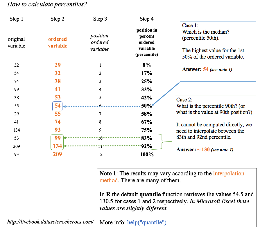
Figure 5.1: How to calculate percentiles
The dataset, an advice before continue:
This contains many indicators regarding world development. Regardless the profiling example, the idea is to provide a ready-to-use table for sociologists, researchers, etc. interested in analyzing this kind of data.
The original data source is: http://databank.worldbank.org. There you will find a data dictionary that explains all the variables.
In this section we’ll be using a table which is already prepared for analysis. The complete step-by-step data preparation is in Profiling chapter.
Any indicator meaning can be checked in data.worldbank.org. For example, if we want to know what EN.POP.SLUM.UR.ZS means, then we type: http://data.worldbank.org/indicator/EN.POP.SLUM.UR.ZS
5.1.1 How to calculate percentiles
There are several methods to get the percentile. Based on interpolations, the easiest way is to order the variable ascendantly, selecting the percentile we want (for example, 75%), and then observing what is the maximum value if we want to choose the 75% of the ordered population.
Now we are going to use the technique of keeping a small sample so that we can have maximum control over what is going on behind the calculus.
We retain the random 10 countries and print the vector of rural_poverty_headcount which is the variable we are going to use.
library(dplyr)

data_world_wide =
  read.delim(file="https://goo.gl/NNYhCW",
             header = T
)data_sample=filter(data_world_wide, Country.Name %in% c("Kazakhstan", "Zambia", "Mauritania", "Malaysia", "Sao Tome and Principe", "Colombia", "Haiti", "Fiji", "Sierra Leone", "Morocco")) %>% arrange(rural_poverty_headcount)
select(data_sample, Country.Name, rural_poverty_headcount)## Country.Name rural_poverty_headcount
## 1 Malaysia 1.6
## 2 Kazakhstan 4.4
## 3 Morocco 14.4
## 4 Colombia 40.3
## 5 Fiji 44.0
## 6 Mauritania 59.4
## 7 Sao Tome and Principe 59.4
## 8 Sierra Leone 66.1
## 9 Haiti 74.9
## 10 Zambia 77.9Please note that the vector is ordered only for didactic purposes. As we said in the Profiling chapter, our eyes like order.
Now we apply the quantile function on rural_poverty_headcount variable (the percentage of the rural population living below the national poverty lines):
quantile(data_sample$rural_poverty_headcount)## 0% 25% 50% 75% 100%
## 1.600 20.875 51.700 64.425 77.900Analysis
- Percentile 50%: 50% of the countries (five of them) have a
rural_poverty_headcountbelow51.7We can check this in the last table: these countries are: Fiji, Colombia, Morocco, Kazakhstan, and Malaysia. - Percentile 25%: 25% of the countries are below 20.87. Here we can see an interpolation because 25% represents ~2.5 countries. If we use this value to filter the countries, then we’ll get three countries: Morocco, Kazakhstan, and Malaysia.
More information about the different types of quantiles and their interpolations: help("quantile").
5.1.1.1 Getting semantical descriptions
From the last example we can state that:
- “Half of the countries have as much as 51.7% of rural poverty”
- “Three-quarters of the countries have a maximum of 64.4% regarding its rural poverty” (based on the countries ordered ascendantly).
We can also think of using the opposite:
- “A quarter of the countries that exhibit the highest rural poverty values have a percentage of at least 64.4%.”
5.1.2 Calculating custom quantiles
Typically, we want to calculate certain quantiles. The example variable will be the gini_index
What is the Gini index?
It is a measure of income or wealth inequality.
- A Gini coefficient of zero expresses perfect equality where all values are the same (for example, where everyone has the same income).
- A Gini coefficient of 1 (or 100%) expresses maximal inequality among values (e.g., for a large number of people, where only one person has all the income or consumption while all others have none, the Gini coefficient will be very nearly one).
Source: https://en.wikipedia.org/wiki/Gini_coefficient
Example in R:
If we want to get the 20, 40, 60, and 80th quantiles of the Gini index variable, we use again the quantile function.
The na.rm=TRUE parameter is necessary if we have empty values like in this case:
# We also can get multiple quantiles at once
p_custom=quantile(data_world_wide$gini_index, probs = c(0.2, 0.4, 0.6, 0.8), na.rm=TRUE)
p_custom
## 20% 40% 60% 80%
## 31.624 35.244 41.076 46.1485.1.3 Indicating where most of the values are
In descriptive statistics, we want to describe the population in general terms. We can speak about ranges using two percentiles. Let’s take the percentiles 10 and 90th to describe 80% of the population.
The poverty ranges from 0.075% to 54.4% in 80% of the countries. (80% because we did 90th–10th, focusing on the middle of the population.)
If we consider the 80% as the majority of the population, then we could say: “Normally (or in general terms), poverty goes from 0.07% to 54.4%”. This is a semantical description.
We looked at 80% of the population, which seems a good number to describe where most of the cases are. We also could have used the 90% range (percentile 95th - 0.5th).
5.1.4 Visualizing quantiles
Plotting a histogram alongisde the places where each percentile is can help us understand the concept:
quantiles_var =
  quantile(data_world_wide$poverty_headcount_1.9,
           c(0.25, 0.5, 0.75),
           na.rm = T
           )

df_p = data.frame(value=quantiles_var,
                quantile=c("25th", "50th", "75th")
                )

library(ggplot2)
ggplot(data_world_wide, aes(poverty_headcount_1.9)) +
  geom_histogram() +
  geom_vline(data=df_p,
             aes(xintercept=value,
                 colour = quantile),
             show.legend = TRUE,
             linetype="dashed"
             ) +
  theme_light()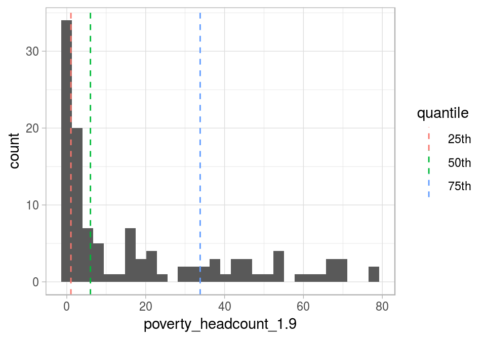
Figure 5.2: Visualizing quantiles
If we sum all the gray bars before the 25th percentile, then it will be around the height of the gray bars sum after the 75th percentile.
In the last plot, the IQR appears between the first and the last dashed lines and contains 50% of the population.
5.1.5 Rank and top/bottom ‘X%’ concepts
The ranking concept is the same as the one seen in competitions. It allows us to answer what is the country with the highest rate in variable pop_living_slums?
We’ll use the dense_rank function from the ggplot2 package. It assigns the position (rank) to each country, but we need them in reverse order; that is, we assign the rank = 1 to the highest value.
Now the variable will be: Population living in slums is the proportion of the urban population living in slum households. A slum household is defined as a group of individuals living under the same roof and lacking one or more of the following conditions: access to improved water, access to improved sanitation, sufficient living area, and durability of housing.
The question to answer: What are the top six countries with the highest rates of people living in slums?
# Creating rank variable
data_world_wide$rank_pop_living_slums =
  dense_rank(-data_world_wide$pop_living_slums)
# Ordering data by rank
data_world_wide=arrange(data_world_wide, rank_pop_living_slums)
# Printing the first six results
select(data_world_wide, Country.Name, rank_pop_living_slums) %>% head(.) ## Country.Name rank_pop_living_slums
## 1 South Sudan 1
## 2 Central African Republic 2
## 3 Sudan 3
## 4 Chad 4
## 5 Sao Tome and Principe 5
## 6 Guinea-Bissau 6We can also ask: In which position is Ecuador?
filter(data_world_wide, Country.Name=="Ecuador") %>% select(rank_pop_living_slums)## rank_pop_living_slums
## 1 575.1.5.0.1 Top and bottom ‘X%’ concepts
Other questions that we may be interested in answering: What is the value for which I get the top 10% of lowest values?
The 10th percentile is the answer:
quantile(data_world_wide$pop_living_slums, probs=.1, na.rm = T)## 10%
## 12.5Working on the opposite: What is the value for which I get the bottom 10% of highest values?
The 90th percentile is the answer, we can filter all the cases above this value:
quantile(data_world_wide$pop_living_slums,
         probs=.9,
         na.rm = T
         )
## 90%
## 75.25.1.6 Percentile in scoring data
There are two chapters that use this concept:
The basic idea is to develop a predictive model that predicts a binary variable (yes/no). Suppose we need to score new cases, for example, to use in a marketing campaign. The question to answer is:
What is the score value to suggest to sales people in order to capture 50% of potential new sales? The answer comes from a combination of percentile analysis on the scoring value plus the cumulative analysis of the current target.
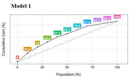
Figure 5.3: Gain and lift curves (model performance)
5.1.6.1 Case study: distribution of wealth
The distribution of wealth is similar to the Gini index and is focused on inequality. It measures owner assets (which is different from income), making the comparison across countries more even to what people can acquire according to the place where they live. For a better definition, please go to the Wikipedia article and Global Wealth Report 2013. Refs. (Wikipedia 2017a) and (Suisse 2013) respectively.
Quoting Wikipedia (Ref. (Wikipedia 2017a)):
half of the world’s wealth belongs to the top 1% of the population;
the top 10% of adults hold 85% while the bottom 90% hold the remaining 15% of the world’s total wealth; and
the top 30% of adults hold 97% of the total wealth.
Just as we did before, from the third sentence we can state that: “3% of total wealth is distributed to 70% of adults.”
The metrics top 10% and top 30% are the quantiles 0.1 and 0.3. Wealth is the numeric variable.
![]()
5.2 funModeling quick-start
This package contains a set of functions related to exploratory data analysis, data preparation, and model performance. It is used by people coming from business, research, and teaching (professors and students).
funModeling is intimately related to this book, in the sense that most of its functionality is used to explain different topics addressed by the book.
5.2.1 Opening the black-box
Some functions have in-line comments so the user can open the black-box and learn how it was developed, or to tune or improve any of them.
All the functions are well documented, explaining all the parameters with the help of many short examples. R documentation can be accessed by: help("name_of_the_function").
Important changes from latest version 1.6.7, (relevant only if you were using previous versions):
From the latest version, 1.6.7 (Jan 21-2018), the parameters str_input, str_target and str_score will be renamed to input, target and score respectively. The functionality remains the same. If you were using these parameters names on production, they will be still working until next release. this means that for now, you can use for example str_input or input.
The other importat change was in discretize_get_bins, which is detailed later in this document.
5.2.1.1 About this quick-start
This quick-start is focused only on the functions. All explanations around them, and the how and when to use them, can be accessed by following the “Read more here.” links below each section, which redirect you to the book.
Below there are most of the funModeling functions divided by category.
5.2.2 Exploratory data analysis
5.2.2.1 df_status: Dataset health status
Use case: analyze the zeros, missing values (NA), infinity, data type, and number of unique values for a given dataset.
library(funModeling)

df_status(heart_disease)
## variable q_zeros p_zeros q_na p_na q_inf p_inf type
## 1 age 0 0.00 0 0.00 0 0 integer
## 2 gender 0 0.00 0 0.00 0 0 factor
## 3 chest_pain 0 0.00 0 0.00 0 0 factor
## 4 resting_blood_pressure 0 0.00 0 0.00 0 0 integer
## 5 serum_cholestoral 0 0.00 0 0.00 0 0 integer
## 6 fasting_blood_sugar 258 85.15 0 0.00 0 0 factor
## 7 resting_electro 151 49.83 0 0.00 0 0 factor
## 8 max_heart_rate 0 0.00 0 0.00 0 0 integer
## 9 exer_angina 204 67.33 0 0.00 0 0 integer
## 10 oldpeak 99 32.67 0 0.00 0 0 numeric
## 11 slope 0 0.00 0 0.00 0 0 integer
## 12 num_vessels_flour 176 58.09 4 1.32 0 0 integer
## 13 thal 0 0.00 2 0.66 0 0 factor
## 14 heart_disease_severity 164 54.13 0 0.00 0 0 integer
## 15 exter_angina 204 67.33 0 0.00 0 0 factor
## 16 has_heart_disease 0 0.00 0 0.00 0 0 factor
## unique
## 1 41
## 2 2
## 3 4
## 4 50
## 5 152
## 6 2
## 7 3
## 8 91
## 9 2
## 10 40
## 11 3
## 12 4
## 13 3
## 14 5
## 15 2
## 16 2[🔎 Read more here.]
5.2.2.2 plot_num: Plotting distributions for numerical variables
Plots only numeric variables.
plot_num(heart_disease)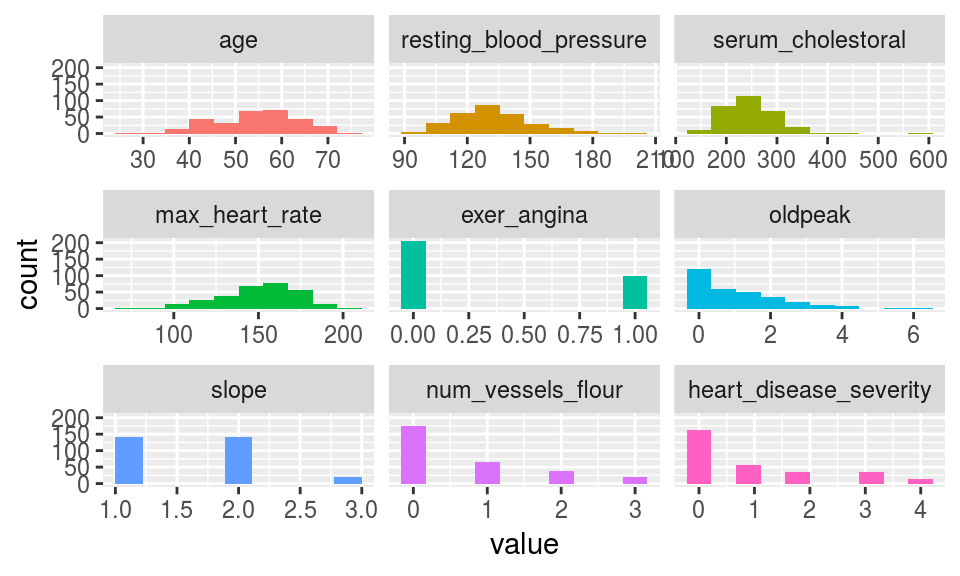
Figure 5.4: plot num: visualizing numerical variables
Notes:
bins: Sets the number of bins (10 by default).path_outindicates the path directory; if it has a value, then the plot is exported in jpeg. To save in current directory path must be dot: “.”
[🔎 Read more here.]
5.2.2.3 profiling_num: Calculating several statistics for numerical variables
Retrieves several statistics for numerical variables.
profiling_num(heart_disease)## variable mean std_dev variation_coef p_01 p_05 p_25
## 1 age 54.44 9.04 0.17 35 40 48
## 2 resting_blood_pressure 131.69 17.60 0.13 100 108 120
## 3 serum_cholestoral 246.69 51.78 0.21 149 175 211
## 4 max_heart_rate 149.61 22.88 0.15 95 108 134
## 5 exer_angina 0.33 0.47 1.44 0 0 0
## 6 oldpeak 1.04 1.16 1.12 0 0 0
## 7 slope 1.60 0.62 0.38 1 1 1
## 8 num_vessels_flour 0.67 0.94 1.39 0 0 0
## 9 heart_disease_severity 0.94 1.23 1.31 0 0 0
## p_50 p_75 p_95 p_99 skewness kurtosis iqr range_98
## 1 56.0 61.0 68.0 71.0 -0.21 2.5 13.0 [35, 71]
## 2 130.0 140.0 160.0 180.0 0.70 3.8 20.0 [100, 180]
## 3 241.0 275.0 326.9 406.7 1.13 7.4 64.0 [149, 406.74]
## 4 153.0 166.0 181.9 192.0 -0.53 2.9 32.5 [95.02, 191.96]
## 5 0.0 1.0 1.0 1.0 0.74 1.5 1.0 [0, 1]
## 6 0.8 1.6 3.4 4.2 1.26 4.5 1.6 [0, 4.2]
## 7 2.0 2.0 3.0 3.0 0.51 2.4 1.0 [1, 3]
## 8 0.0 1.0 3.0 3.0 1.18 3.2 1.0 [0, 3]
## 9 0.0 2.0 3.0 4.0 1.05 2.8 2.0 [0, 4]
## range_80
## 1 [42, 66]
## 2 [110, 152]
## 3 [188.8, 308.8]
## 4 [116, 176.6]
## 5 [0, 1]
## 6 [0, 2.8]
## 7 [1, 2]
## 8 [0, 2]
## 9 [0, 3]Note:
plot_numandprofiling_numautomatically exclude non-numeric variables
[🔎 Read more here.]
5.2.2.4 freq: Getting frequency distributions for categoric variables
library(dplyr)

# Select only two variables for this example
heart_disease_2=heart_disease %>% select(chest_pain, thal)

# Frequency distribution
freq(heart_disease_2)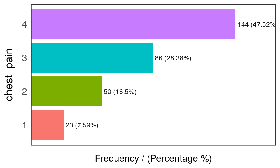
Figure 5.5: freq: visualizing categorical variables
##   chest_pain frequency percentage cumulative_perc
## 1          4       144       47.5              48
## 2          3        86       28.4              76
## 3          2        50       16.5              92
## 4          1        23        7.6             100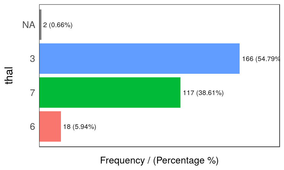
Figure 5.5: freq: visualizing categorical variables
##   thal frequency percentage cumulative_perc
## 1    3       166      54.79              55
## 2    7       117      38.61              93
## 3    6        18       5.94              99
## 4 <NA>         2       0.66             100
## [1] "Variables processed: chest_pain, thal"Notes:
freqonly processesfactorandcharacter, excluding non-categorical variables.- It returns the distribution table as a data frame.
- If
inputis empty, then it runs for all categorical variables. path_outindicates the path directory; if it has a value, then the plot is exported in jpeg. To save in current directory path must be dot: “.”na.rmindicates ifNAvalues should be excluded (FALSEby default).
[🔎 Read more here.]
5.2.3 Correlations
5.2.3.1 correlation_table: Calculates R statistic
Retrieves R metric (or Pearson coefficient) for all numeric variables, skipping the categoric ones.
correlation_table(heart_disease, "has_heart_disease")## Variable has_heart_disease
## 1 has_heart_disease 1.00
## 2 heart_disease_severity 0.83
## 3 num_vessels_flour 0.46
## 4 oldpeak 0.42
## 5 slope 0.34
## 6 age 0.23
## 7 resting_blood_pressure 0.15
## 8 serum_cholestoral 0.08
## 9 max_heart_rate -0.42Notes:
- Only numeric variables are analyzed. Target variable must be numeric.
- If target is categorical, then it will be converted to numeric.
[🔎 Read more here.]
5.2.3.2 var_rank_info: Correlation based on information theory
Calculates correlation based on several information theory metrics between all variables in a data frame and a target variable.
var_rank_info(heart_disease, "has_heart_disease")## var en mi ig gr
## 1 heart_disease_severity 1.8 0.995 0.99508 0.53907
## 2 thal 2.0 0.209 0.20946 0.16805
## 3 exer_angina 1.8 0.139 0.13914 0.15264
## 4 exter_angina 1.8 0.139 0.13914 0.15264
## 5 chest_pain 2.5 0.205 0.20502 0.11803
## 6 num_vessels_flour 2.4 0.182 0.18152 0.11577
## 7 slope 2.2 0.112 0.11242 0.08688
## 8 serum_cholestoral 7.5 0.561 0.56056 0.07956
## 9 gender 1.8 0.057 0.05725 0.06330
## 10 oldpeak 4.9 0.249 0.24917 0.06036
## 11 max_heart_rate 6.8 0.334 0.33362 0.05407
## 12 resting_blood_pressure 5.6 0.143 0.14255 0.03024
## 13 age 5.9 0.137 0.13718 0.02705
## 14 resting_electro 2.1 0.024 0.02415 0.02219
## 15 fasting_blood_sugar 1.6 0.000 0.00046 0.00076Note: It analyzes numerical and categorical variables. It is also used with the numeric discretization method as before, just as discretize_df.
[🔎 Read more here.]
5.2.3.3 cross_plot: Distribution plot between input and target variable
Retrieves the relative and absolute distribution between an input and target variable. Useful to explain and report if a variable is important or not.
cross_plot(data=heart_disease, input=c("age", "oldpeak"), target="has_heart_disease")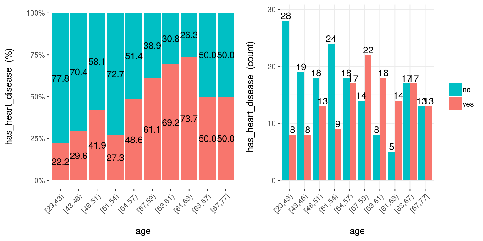
Figure 5.6: cross plot: visualizing input vs. target variable
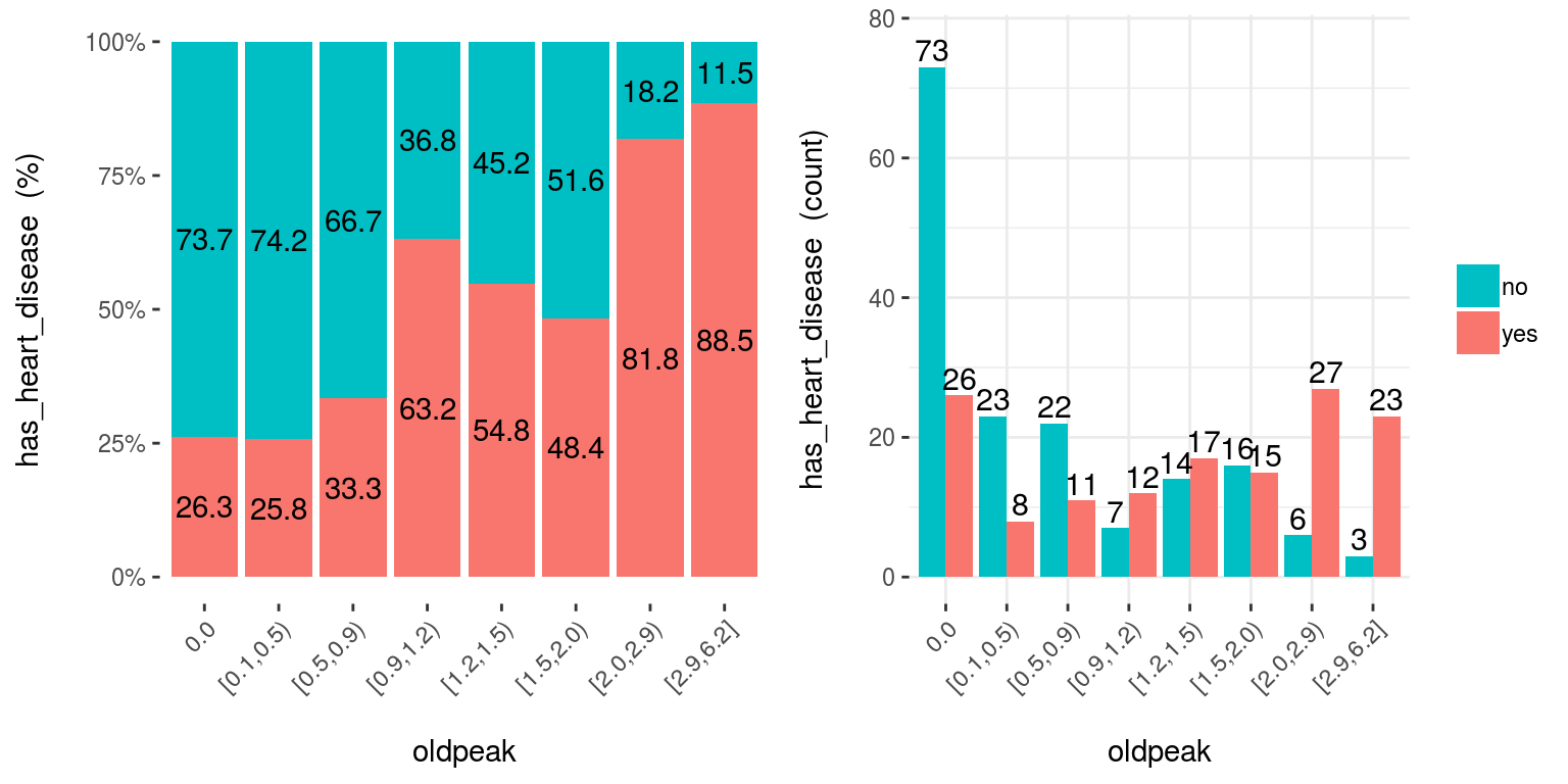
Figure 5.6: cross plot: visualizing input vs. target variable
Notes:
auto_binning:TRUEby default, shows the numerical variable as categorical.path_outindicates the path directory; if it has a value, then the plot is exported in jpeg.inputcan be numeric or categoric, andtargetmust be a binary (two-class) variable.- If
inputis empty, then it runs for all variables.
[🔎 Read more here.]
5.2.3.4 plotar: Boxplot and density histogram between input and target variables
Useful to explain and report if a variable is important or not.
Boxplot:
plotar(data=heart_disease, input = c("age", "oldpeak"), target="has_heart_disease", plot_type="boxplot")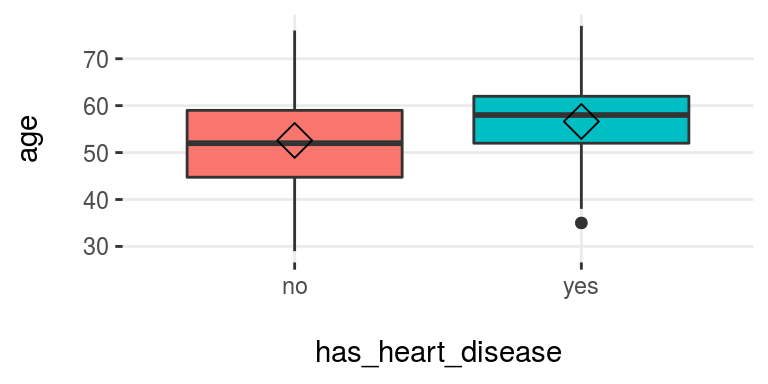
Figure 3.16: plotar (1): visualizing boxplot
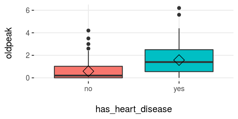
Figure 3.16: plotar (1): visualizing boxplot
[🔎 Read more here.]
Density histograms:
plotar(data=mtcars, input = "gear", target="cyl", plot_type="histdens")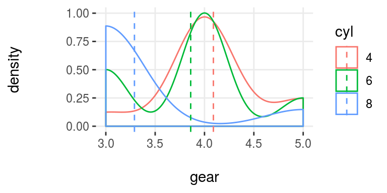
Figure 5.7: plotar (2): visualizing density histogram
[🔎 Read more here.]
Notes:
path_outindicates the path directory; if it has a value, then the plot is exported in jpeg.- If
inputis empty, then it runs for all numeric variables (skipping the categorical ones). inputmust be numeric and target must be categoric.targetcan be multi-class (not only binary).
5.2.3.5 categ_analysis: Quantitative analysis for binary outcome
Profile a binary target based on a categorical input variable, the representativeness (perc_rows) and the accuracy (perc_target) for each value of the input variable; for example, the rate of flu infection per country.
df_ca=categ_analysis(data = data_country, input = "country", target = "has_flu")

head(df_ca)
## country mean_target sum_target perc_target q_rows perc_rows
## 1 Malaysia 1.00 1 0.012 1 0.001
## 2 Mexico 0.67 2 0.024 3 0.003
## 3 Portugal 0.20 1 0.012 5 0.005
## 4 United Kingdom 0.18 8 0.096 45 0.049
## 5 Uruguay 0.17 11 0.133 63 0.069
## 6 Israel 0.17 1 0.012 6 0.007Note:
inputvariable must be categorical.targetvariable must be binary (two-value).
This function is used to analyze data when we need to reduce variable cardinality in predictive modeling.
[🔎 Read more here.]
5.2.4 Data preparation
5.2.4.1 Data discretization
5.2.4.1.1 discretize_get_bins + discretize_df: Convert numeric variables to categoric
We need two functions: discretize_get_bins, which returns the thresholds for each variable, and then discretize_df, which takes the result from the first function and converts the desired variables. The binning criterion is equal frequency.
Example converting only two variables from a dataset.
# Step 1: Getting the thresholds for the desired variables: "max_heart_rate" and "oldpeak"
d_bins=discretize_get_bins(data=heart_disease, input=c("max_heart_rate", "oldpeak"), n_bins=5)
## [1] "Variables processed: max_heart_rate, oldpeak"# Step 2: Applying the threshold to get the final
# processed data frame
heart_disease_discretized =
discretize_df(data=heart_disease,
data_bins=d_bins,
stringsAsFactors=T
)## [1] "Variables processed: max_heart_rate, oldpeak"The following image illustrates the result. Please note that the variable name remains the same.
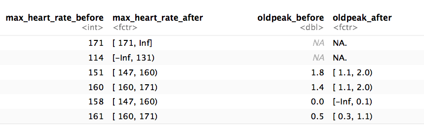
Figure 5.8: Results of the automatic discretization process
Notes:
- This two-step procedure is thought to be used in production with new data.
- Min and max values for each bin will be
-InfandInf, respectively. - A fix in the latest
funModelingrelease (1.6.7) may change the output in certain scenarios. Please check the results if you were using version 1.6.6. More info about this change here.
[🔎 Read more here.]
5.2.4.2 convert_df_to_categoric: Convert every column in a data frame to character variables
Binning, or discretization criterion for any numerical variable is equal frequency. Factor variables are directly converted to character variables.
iris_char=convert_df_to_categoric(data = iris, n_bins = 5)

# checking first rows
head(iris_char)
5.2.4.3 equal_freq: Convert numeric variable to categoric
Converts numeric vector into a factor using the equal frequency criterion.
new_age=equal_freq(heart_disease$age, n_bins = 5)

# checking results
Hmisc::describe(new_age)
## new_age
## n missing distinct
## 303 0 5
##
## Value [29,46) [46,54) [54,59) [59,63) [63,77]
## Frequency 63 64 71 45 60
## Proportion 0.21 0.21 0.23 0.15 0.20[🔎 Read more here.]
Notes:
- Unlike
discretize_get_bins, this function doesn’t insert-InfandInfas the min and max value respectively.
5.2.4.4 range01: Scales variable into the 0 to 1 range
Convert a numeric vector into a scale from 0 to 1 with 0 as the minimum and 1 as the maximum.
age_scaled=range01(heart_disease$oldpeak)

# checking results
summary(age_scaled)
## Min. 1st Qu. Median Mean 3rd Qu. Max.
## 0.00 0.00 0.13 0.17 0.26 1.005.2.5 Outliers data preparation
5.2.5.1 hampel_outlier and tukey_outlier: Gets outliers threshold
Both functions retrieve a two-value vector that indicates the thresholds for which the values are considered as outliers. The functions tukey_outlier and hampel_outlier are used internally in prep_outliers.
Using Tukey’s method:
tukey_outlier(heart_disease$resting_blood_pressure)## bottom_threshold top_threshold
## 60 200[🔎 Read more here.]
Using Hampel’s method:
hampel_outlier(heart_disease$resting_blood_pressure)## bottom_threshold top_threshold
## 86 174[🔎 Read more here.]
5.2.5.2 prep_outliers: Prepare outliers in a data frame
Takes a data frame and returns the same data frame plus the transformations specified in the input parameter. It also works with a single vector.
Example considering two variables as input:
# Get threshold according to Hampel's method
hampel_outlier(heart_disease$max_heart_rate)
## bottom_threshold top_threshold
## 86 220# Apply function to stop outliers at the threshold values
data_prep=prep_outliers(data = heart_disease, input = c('max_heart_rate','resting_blood_pressure'), method = "hampel", type='stop')Checking the before and after for variable max_heart_rate:
## [1] "Before transformation -> Min: 71; Max: 202"## [1] "After transformation -> Min: 86.283; Max: 202"The min value changed from 71 to 86.23, while the max value remains the same at 202.
Notes:
methodcan be:bottom_top,tukeyorhampel.typecan be:stoporset_na. Ifstopall values flagged as outliers will be set to the threshold. Ifset_na, then the flagged values will set toNA.
[🔎 Read more here.]
5.2.6 Predictive model performance
5.2.6.1 gain_lift: Gain and lift performance curve
After computing the scores or probabilities for the class we want to predict, we pass it to the gain_lift function, which returns a data frame with performance metrics.
# Create machine learning model and get its scores for positive case
fit_glm=glm(has_heart_disease ~ age + oldpeak, data=heart_disease, family = binomial)
heart_disease$score=predict(fit_glm, newdata=heart_disease, type='response')

# Calculate performance metrics
gain_lift(data=heart_disease, score='score', target='has_heart_disease')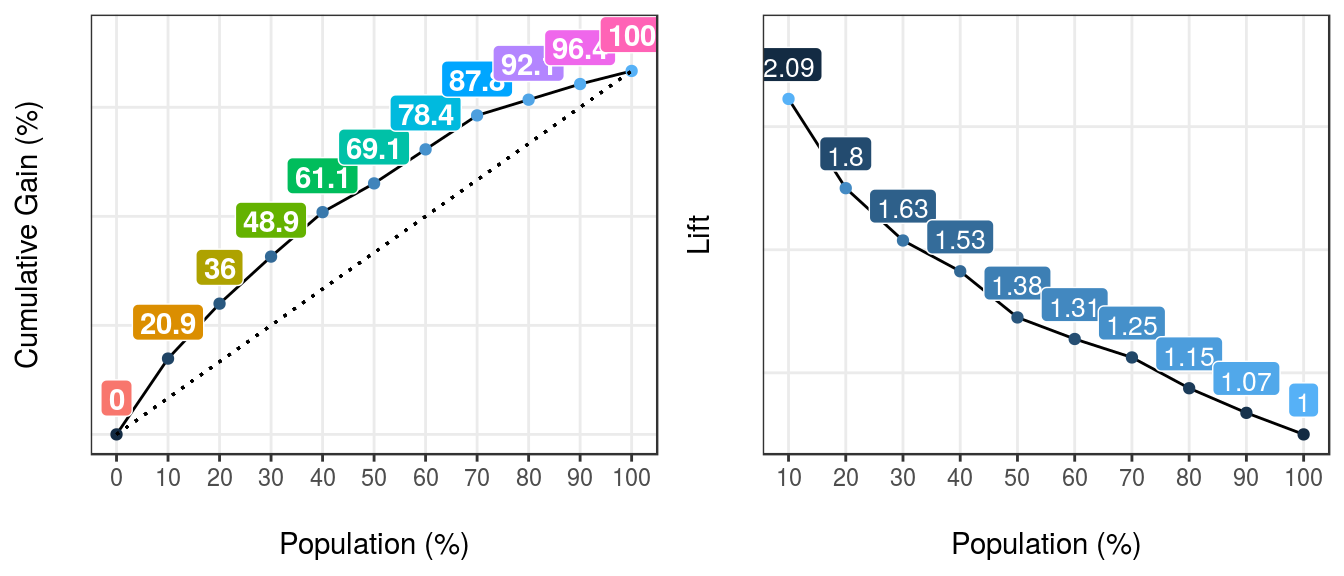
Figure 5.9: gain lift: visualizing predictive model performance
##    Population Gain Lift Score.Point
## 1          10   21  2.1        0.82
## 2          20   36  1.8        0.70
## 3          30   49  1.6        0.57
## 4          40   61  1.5        0.49
## 5          50   69  1.4        0.40
## 6          60   78  1.3        0.33
## 7          70   88  1.2        0.29
## 8          80   92  1.1        0.25
## 9          90   96  1.1        0.20
## 10        100  100  1.0        0.12
[🔎 Read more here.]
![]()
References
stats.stackexchange.com. 2015. “Gradient Boosting Machine Vs Random Forest.” https://stats.stackexchange.com/questions/173390/gradient-boosting-tree-vs-random-forest.
2017a. “How to Interpret Mean Decrease in Accuracy and Mean Decrease Gini in Random Forest Models.” http://stats.stackexchange.com/questions/197827/how-to-interpret-mean-decrease-in-accuracy-and-mean-decrease-gini-in-random-fore. 2017b. “Percentile Vs Quantile Vs Quartile.” https://stats.stackexchange.com/questions/156778/percentile-vs-quantile-vs-quartile.Wikipedia. 2017a. “Distribution of Wealth.” https://en.wikipedia.org/wiki/Distribution_of_wealth.
Suisse, Credit. 2013. “Global Wealth Report 2013.” https://publications.credit-suisse.com/tasks/render/file/?fileID=BCDB1364-A105-0560-1332EC9100FF5C83.