1 Exploratory Data Analysis
Listening to the numbers :)
1.1 Profiling, The voice of the numbers

“The voice of the numbers” – a metaphor by Eduardo Galeano. Writer and novelist.
The data we explore could be like Egyptian hieroglyphs without a correct interpretation. Profiling is the very first step in a series of iterative stages in the pursuit of finding what the data want to tell us, if we are patient enough to listen.
This chapter will cover, with a few functions, a complete data profiling. This should be the entry step in a data project, where we start by knowing the correct data types and exploring distributions in numerical and categorical variables.
It also focuses on the extraction of semantic conclusions, which is useful when writing a report for non-technical people.
What are we going to review in this chapter?
- Dataset health status:
- Getting metrics like total rows, columns, data types, zeros, and missing values
- How each of the previous items impacts on different analysis
- How to quickly filter and operate on (and with) them, to clean the data
- Univariate analysis in categorical variable:
- Frequency, percentage, cumulative value, and colorful plots
- Univariate analysis with numerical variables:
- Percentile, dispersion, standard deviation, mean, top and bottom values
- Percentile vs. quantile vs. quartile
- Kurtosis, skewness, inter-quartile range, variation coefficient
- Plotting distributions
- Complete case study based on “Data World”, data preparation, and data analysis
Functions summary review in the chapter:
df_status(data): Profiling dataset structuredescribe(data): Numerical and categorical profiling (quantitative)freq(data): Categorical profiling (quantitative and plot).profiling_num(data): Profiling for numerical variables (quantitative)plot_num(data): Profiling for numerical variables (plots)
Note: describe is in the Hmisc package while remaining functions are in funModeling.
1.1.1 Dataset health status
The quantity of zeros, NA, Inf, unique values as well as the data type may lead to a good or bad model. Here’s an approach to cover the very first step in data modeling.
First, we load the funModeling and dplyr libraries.
# Loading funModeling!
library(funModeling)
library(dplyr)
data(heart_disease)
1.1.1.1 Checking missing values, zeros, data type, and unique values
Probably one of the first steps, when we get a new dataset to analyze, is to know if there are missing values (NA in R) and the data type.
The df_status function coming in funModeling can help us by showing these numbers in relative and percentage values. It also retrieves the infinite and zeros statistics.
# Profiling the data input
df_status(heart_disease)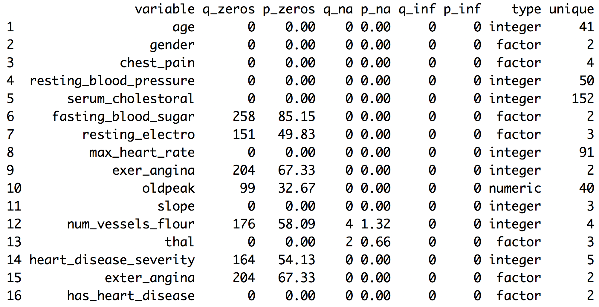
Figure 1.1: Dataset health status
q_zeros: quantity of zeros (p_zeros: in percent)q_inf: quantity of infinite values (p_inf: in percent)q_na: quantity of NA (p_na: in percent)type: factor or numericunique: quantity of unique values
1.1.1.2 Why are these metrics important?
- Zeros: Variables with lots of zeros may not be useful for modeling and, in some cases, they may dramatically bias the model.
- NA: Several models automatically exclude rows with NA (random forest for example). As a result, the final model can be biased due to several missing rows because of only one variable. For example, if the data contains only one out of 100 variables with 90% of NAs, the model will be training with only 10% of the original rows.
- Inf: Infinite values may lead to an unexpected behavior in some functions in R.
- Type: Some variables are encoded as numbers, but they are codes or categories and the models don’t handle them in the same way.
- Unique: Factor/categorical variables with a high number of different values (~30) tend to do overfitting if the categories have low cardinality (decision trees, for example).
1.1.1.3 Filtering unwanted cases
The function df_status takes a data frame and returns a status table that can help us quickly remove features (or variables) based on all the metrics described in the last section. For example:
Removing variables with a high number of zeros
# Profiling the Data Input
my_data_status=df_status(heart_disease, print_results = F)

# Removing variables with 60% of zero values
vars_to_remove=filter(my_data_status, p_zeros > 60)  %>% .$variable
vars_to_remove
## [1] "fasting_blood_sugar" "exer_angina" "exter_angina"# Keeping all columns except the ones present in 'vars_to_remove' vector
heart_disease_2=select(heart_disease, -one_of(vars_to_remove))Ordering data by percentage of zeros
arrange(my_data_status, -p_zeros) %>% select(variable, q_zeros, p_zeros)## variable q_zeros p_zeros
## 1 fasting_blood_sugar 258 85.15
## 2 exer_angina 204 67.33
## 3 exter_angina 204 67.33
## 4 num_vessels_flour 176 58.09
## 5 heart_disease_severity 164 54.13
## 6 resting_electro 151 49.83
## 7 oldpeak 99 32.67
## 8 age 0 0.00
## 9 gender 0 0.00
## 10 chest_pain 0 0.00
## 11 resting_blood_pressure 0 0.00
## 12 serum_cholestoral 0 0.00
## 13 max_heart_rate 0 0.00
## 14 slope 0 0.00
## 15 thal 0 0.00
## 16 has_heart_disease 0 0.00The same reasoning applies when we want to remove (or keep) those variables above or below a certain threshold. Please check the missing values chapter to get more information about the implications when dealing with variables containing missing values.
1.1.1.4 Going deep into these topics
Values returned by df_status are deeply covered in other chapters:
- Missing values (NA) treatment, analysis, and imputation are deeply covered in the Missing Data chapter.
- Data type, its conversions and implications when handling different data types and more are covered in the Data Types chapter.
- A high number of unique values is synonymous for high-cardinality variables. This situation is studied in both chapters:
1.1.1.5 Getting other common statistics: total rows, total columns and column names:
# Total rows
nrow(heart_disease)
## [1] 303# Total columns
ncol(heart_disease)## [1] 16# Column names
colnames(heart_disease)## [1] "age" "gender"
## [3] "chest_pain" "resting_blood_pressure"
## [5] "serum_cholestoral" "fasting_blood_sugar"
## [7] "resting_electro" "max_heart_rate"
## [9] "exer_angina" "oldpeak"
## [11] "slope" "num_vessels_flour"
## [13] "thal" "heart_disease_severity"
## [15] "exter_angina" "has_heart_disease"1.1.2 Profiling categorical variables
Make sure you have the latest ‘funModeling’ version (>= 1.6).
Frequency or distribution analysis is made simple by the freq function. This retrieves the distribution in a table and a plot (by default) and shows the distribution of absolute and relative numbers.
If you want the distribution for two variables:
freq(data=heart_disease, input = c('thal','chest_pain'))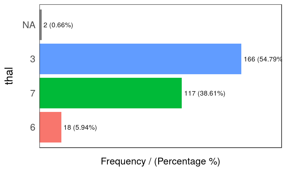
Figure 1.2: Frequency analysis 1
##   thal frequency percentage cumulative_perc
## 1    3       166      54.79           54.79
## 2    7       117      38.61           93.40
## 3    6        18       5.94           99.34
## 4 <NA>         2       0.66          100.00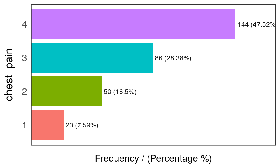
Figure 1.2: Frequency analysis 2
##   chest_pain frequency percentage cumulative_perc
## 1          4       144      47.52           47.52
## 2          3        86      28.38           75.90
## 3          2        50      16.50           92.40
## 4          1        23       7.59          100.00
## [1] "Variables processed: thal, chest_pain"As well as in the remaining funModeling functions, if input is missing, then it will run for all factor or character variables present in a given data frame:
freq(data=heart_disease)If we only want to print the table excluding the plot, then we set the plot parameter to FALSE. The freq example can also handle a single variable as an input. By default, NA values are considered in both the table and the plot. If it is needed to exclude the NA then set na.rm = TRUE. Both examples in the following line:
freq(data=heart_disease$thal, plot = FALSE, na.rm = TRUE)If only one variable is provided, then freq returns the printed table; thus, it is easy to perform some calculations based on the variables it provides.
- For example, to print the categories that represent most of the 80% of the share (based on
cumulative_perc < 80). - To get the categories belonging to the long tail, i.e., filtering by
percentage < 1by retrieving those categories appearing less than 1% of the time.
In addition, as with the other plot functions in the package, if there is a need to export plots, then add the path_out parameter, which will create the folder if it’s not yet created.
freq(data=heart_disease, path_out='my_folder')1.1.2.0.1 Analysis
The output is ordered by the frequency variable, which quickly analyzes the most frequent categories and how many shares they represent (cummulative_perc variable). In general terms, we as human beings like order. If the variables are not ordered, then our eyes start moving over all the bars to do the comparison and our brains place each bar in relation to the other bars.
Check the difference for the same data input, first without order and then with order:
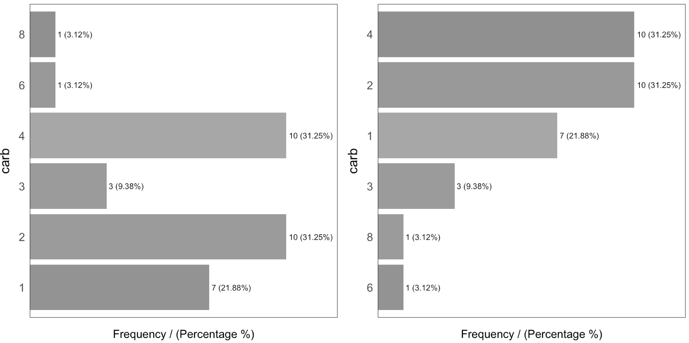
Figure 1.3: Order and beauty
Generally, there are just a few categories that appear most of the time.
A more complete analysis is in High Cardinality Variable in Descriptive Stats
1.1.2.1 Introducing the describe function
This function comes in the Hmisc package and allows us to quickly profile a complete dataset for both numerical and categorical variables. In this case, we’ll select only two variables and we will analyze the result.
# Just keeping two variables to use in this example
heart_disease_3=select(heart_disease, thal, chest_pain)

# Profiling the data!
describe(heart_disease_3)
## heart_disease_3
##
## 2 Variables 303 Observations
## ---------------------------------------------------------------------------
## thal
## n missing distinct
## 301 2 3
##
## Value 3 6 7
## Frequency 166 18 117
## Proportion 0.551 0.060 0.389
## ---------------------------------------------------------------------------
## chest_pain
## n missing distinct
## 303 0 4
##
## Value 1 2 3 4
## Frequency 23 50 86 144
## Proportion 0.076 0.165 0.284 0.475
## ---------------------------------------------------------------------------Where:
n: quantity of non-NArows. In this case, it indicates there are301patients containing a number.missing: number of missing values. Summing this indicator tongives us the total number of rows.unique: number of unique (or distinct) values.
The other information is pretty similar to the freq function and returns between parentheses the total number in relative and absolute values for each different category.
1.1.3 Profiling numerical variables
This section is separated into two parts:
- Part 1: Introducing the “World Data” case study
- Part 2: Doing the numerical profiling in R
If you don’t want to know how the data preparation stage from Data World is calculated, then you can jump to “Part 2: Doing the numerical profiling in R”, when the profiling started.
1.1.3.1 Part 1: Introducing the World Data case study
This contains many indicators regarding world development. Regardless the profiling example, the idea is to provide a ready-to-use table for sociologists, researchers, etc. interested in analyzing this kind of data.
The original data source is: http://databank.worldbank.org. There you will find a data dictionary that explains all the variables.
First, we have to do some data wrangling. We are going to keep with the newest value per indicator.
library(Hmisc)

# Loading data from the book repository without altering the format
data_world=read.csv(file = "https://goo.gl/2TrDgN", header = T, stringsAsFactors = F, na.strings = "..")

# Excluding missing values in Series.Code. The data downloaded from the web page contains four lines with "free-text" at the bottom of the file.
data_world=filter(data_world, Series.Code!="")

# The magical function that keeps the newest values for each metric. If you're not familiar with R, then skip it.
max_ix<-function(d)
{
  ix=which(!is.na(d))
  res=ifelse(length(ix)==0, NA, d[max(ix)])
  return(res)
}

data_world$newest_value=apply(data_world[,5:ncol(data_world)], 1, FUN=max_ix)

# Printing the first three rows
head(data_world, 3)
## Series.Name Series.Code
## 1 Population living in slums (% of urban population) EN.POP.SLUM.UR.ZS
## 2 Population living in slums (% of urban population) EN.POP.SLUM.UR.ZS
## 3 Population living in slums (% of urban population) EN.POP.SLUM.UR.ZS
## Country.Name Country.Code X1990..YR1990. X2000..YR2000. X2007..YR2007.
## 1 Afghanistan AFG NA NA NA
## 2 Albania ALB NA NA NA
## 3 Algeria DZA 11.8 NA NA
## X2008..YR2008. X2009..YR2009. X2010..YR2010. X2011..YR2011.
## 1 NA NA NA NA
## 2 NA NA NA NA
## 3 NA NA NA NA
## X2012..YR2012. X2013..YR2013. X2014..YR2014. X2015..YR2015.
## 1 NA NA 62.7 NA
## 2 NA NA NA NA
## 3 NA NA NA NA
## X2016..YR2016. newest_value
## 1 NA 62.7
## 2 NA NA
## 3 NA 11.8The columns Series.Name and Series.Code are the indicators to be analyzed. Country.Name and Country.Code are the countries. Each row represents a unique combination of country and indicator. Remaining columns, X1990..YR1990. (year 1990),X2000..YR2000. (year 2000), X2007..YR2007. (year 2007), and so on indicate the metric value for that year, thus each column is a year.
1.1.3.2 Making a data scientist decision
There are many NAs because some countries don’t have the measure of the indicator in those years. At this point, we need to make a decision as a data scientist. Probably no the optimal if we don’t ask to an expert, e.g., a sociologist.
What to do with the NA values? In this case, we are going to to keep with the newest value for all the indicators. Perhaps this is not the best way to extract conclusions for a paper as we are going to compare some countries with information up to 2016 while other countries will be updated only to 2009. To compare all the indicators with the newest data is a valid approach for the first analysis.
Another solution could have been to keep with the newest value, but only if this number belongs to the last five years. This would reduce the number of countries to analyze.
These questions are impossible to answer for an artificial intelligence system, yet the decision can change the results dramatically.
The last transformation
The next step will convert the last table from long to wide format. In other words, each row will represent a country and each column an indicator (thanks to the last transformation that has the newest value for each combination of indicator-country).
The indicator names are unclear, so we will “translate” a few of them.
# Get the list of indicator descriptions.
names=unique(select(data_world, Series.Name, Series.Code))
head(names, 5)
## Series.Name Series.Code
## 1 Population living in slums (% of urban population) EN.POP.SLUM.UR.ZS
## 218 Income share held by second 20% SI.DST.02ND.20
## 435 Income share held by third 20% SI.DST.03RD.20
## 652 Income share held by fourth 20% SI.DST.04TH.20
## 869 Income share held by highest 20% SI.DST.05TH.20# Convert a few
df_conv_world=data.frame(
new_name=c("urban_poverty_headcount",
"rural_poverty_headcount",
"gini_index",
"pop_living_slums",
"poverty_headcount_1.9"),
Series.Code=c("SI.POV.URHC",
"SI.POV.RUHC",
"SI.POV.GINI",
"EN.POP.SLUM.UR.ZS",
"SI.POV.DDAY"),
stringsAsFactors = F)
# adding the new indicator value
data_world_2 = left_join(data_world,
df_conv_world,
by="Series.Code",
all.x=T)
data_world_2 =
mutate(data_world_2, Series.Code_2=
ifelse(!is.na(new_name),
as.character(data_world_2$new_name),
data_world_2$Series.Code)
)Any indicator meaning can be checked in data.worldbank.org. For example, if we want to know what EN.POP.SLUM.UR.ZS means, then we type: http://data.worldbank.org/indicator/EN.POP.SLUM.UR.ZS
# The package 'reshape2' contains both 'dcast' and 'melt' functions
library(reshape2)

data_world_wide=dcast(data_world_2, Country.Name  ~ Series.Code_2, value.var = "newest_value")
Note: To understand more about long and wide format using reshape2 package, and how to convert from one to another, please go to http://seananderson.ca/2013/10/19/reshape.html.
Now we have the final table to analyze:
# Printing the first three rows
head(data_world_wide, 3)
## Country.Name gini_index pop_living_slums poverty_headcount_1.9
## 1 Afghanistan NA 62.7 NA
## 2 Albania 28.96 NA 1.06
## 3 Algeria NA 11.8 NA
## rural_poverty_headcount SI.DST.02ND.20 SI.DST.03RD.20 SI.DST.04TH.20
## 1 38.3 NA NA NA
## 2 15.3 13.17 17.34 22.81
## 3 4.8 NA NA NA
## SI.DST.05TH.20 SI.DST.10TH.10 SI.DST.FRST.10 SI.DST.FRST.20 SI.POV.2DAY
## 1 NA NA NA NA NA
## 2 37.82 22.93 3.66 8.85 6.79
## 3 NA NA NA NA NA
## SI.POV.GAP2 SI.POV.GAPS SI.POV.NAGP SI.POV.NAHC SI.POV.RUGP SI.POV.URGP
## 1 NA NA 8.4 35.8 9.3 5.6
## 2 1.43 0.22 2.9 14.3 3.0 2.9
## 3 NA NA NA 5.5 0.8 1.1
## SI.SPR.PC40 SI.SPR.PC40.ZG SI.SPR.PCAP SI.SPR.PCAP.ZG
## 1 NA NA NA NA
## 2 4.08 -1.2205 7.41 -1.3143
## 3 NA NA NA NA
## urban_poverty_headcount
## 1 27.6
## 2 13.6
## 3 5.81.1.3.3 Part 2: Doing the numerical profiling in R
We will see the following functions:
describefromHmiscprofiling_num(full univariate analysis), andplot_num(hisotgrams) fromfunModeling
We’ll pick up only two variables as an example:
library(Hmisc) # contains the `describe` function

vars_to_profile=c("gini_index", "poverty_headcount_1.9")
data_subset=select(data_world_wide, one_of(vars_to_profile))

# Using the `describe` on a complete dataset. # It can be run with one variable; for example, describe(data_subset$poverty_headcount_1.9)

describe(data_subset)
## data_subset
##
## 2 Variables 217 Observations
## ---------------------------------------------------------------------------
## gini_index
## n missing distinct Info Mean Gmd .05 .10
## 140 77 136 1 38.8 9.594 26.81 27.58
## .25 .50 .75 .90 .95
## 32.35 37.69 43.92 50.47 53.53
##
## lowest : 24.09 25.59 25.90 26.12 26.13, highest: 56.24 60.46 60.79 60.97 63.38
## ---------------------------------------------------------------------------
## poverty_headcount_1.9
## n missing distinct Info Mean Gmd .05 .10
## 116 101 107 1 18.33 23.56 0.025 0.075
## .25 .50 .75 .90 .95
## 1.052 6.000 33.815 54.045 67.328
##
## lowest : 0.00 0.01 0.03 0.04 0.06, highest: 68.64 68.74 70.91 77.08 77.84
## ---------------------------------------------------------------------------Taking poverty_headcount_1.9 (Poverty headcount ratio at $1.90 a day is the percentage of the population living on less than $1.90 a day at 2011 international prices.), we can describe it as:
n: quantity of non-NArows. In this case, it indicates116countries that contain a number.missing: number of missing values. Summing this indicator tongives us the total number of rows. Almost half of the countries have no data.unique: number of unique (or distinct) values.Info: an estimator of the amount of information present in the variable and not important at this point.Mean: the classical mean or average.- Numbers:
.05,.10,.25,.50,.75,.90and.95stand for the percentiles. These values are really useful since it helps us to describe the distribution. It will be deeply covered later on, i.e.,.05is the 5th percentile. lowestandhighest: the five lowest/highest values. Here, we can spot outliers and data errors. For example, if the variable represents a percentage, then it cannot contain negative values.
The next function is profiling_num which takes a data frame and retrieves a big table, easy to get overwhelmed in a sea of metrics. This is similar to what we can see in the movie The Matrix.

Figure 1.4: The matrix of data
Picture from the movie: “The Matrix” (1999). The Wachowski Brothers (Directors).
The idea of the following table is to give to the user a full set of metrics,, for then, she or he can decide which ones to pick for the study.
Note: Every metric has a lot of statistical theory behind it. Here we’ll be covering just a tiny and oversimplified approach to introduce the concepts.
library(funModeling)

# Full numerical profiling in one function automatically excludes non-numerical variables
profiling_num(data_world_wide)
## variable mean std_dev variation_coef p_01 p_05
## 1 gini_index 38.8 8.49 0.22 25.711 26.815
## 2 pop_living_slums 45.7 23.66 0.52 6.830 10.750
## 3 poverty_headcount_1.9 18.3 22.74 1.24 0.000 0.025
## 4 rural_poverty_headcount 41.2 21.91 0.53 2.902 6.465
## 5 SI.DST.02ND.20 10.9 2.17 0.20 5.568 7.361
## 6 SI.DST.03RD.20 15.2 2.03 0.13 9.137 11.828
## 7 SI.DST.04TH.20 21.5 1.49 0.07 16.286 18.288
## 8 SI.DST.05TH.20 45.9 7.14 0.16 35.004 36.360
## 9 SI.DST.10TH.10 30.5 6.75 0.22 20.729 21.988
## 10 SI.DST.FRST.10 2.5 0.87 0.34 0.916 1.147
## 11 SI.DST.FRST.20 6.5 1.87 0.29 2.614 3.369
## 12 SI.POV.2DAY 32.4 30.64 0.95 0.061 0.393
## 13 SI.POV.GAP2 14.2 16.40 1.16 0.012 0.085
## 14 SI.POV.GAPS 6.9 10.10 1.46 0.000 0.000
## 15 SI.POV.NAGP 12.2 10.12 0.83 0.421 1.225
## 16 SI.POV.NAHC 30.7 17.88 0.58 1.842 6.430
## 17 SI.POV.RUGP 15.9 11.83 0.75 0.740 1.650
## 18 SI.POV.URGP 8.3 8.24 0.99 0.300 0.900
## 19 SI.SPR.PC40 10.3 9.75 0.95 0.857 1.228
## 20 SI.SPR.PC40.ZG 2.0 3.62 1.85 -6.232 -3.021
## 21 SI.SPR.PCAP 21.1 17.44 0.83 2.426 3.138
## 22 SI.SPR.PCAP.ZG 1.5 3.21 2.20 -5.897 -3.805
## 23 urban_poverty_headcount 23.3 15.06 0.65 0.579 3.140
## p_25 p_50 p_75 p_95 p_99 skewness kurtosis iqr range_98
## 1 32.348 37.7 43.9 53.5 60.9 0.552 2.9 11.6 [25.71, 60.9]
## 2 25.175 46.2 65.6 83.4 93.4 0.087 2.0 40.5 [6.83, 93.41]
## 3 1.052 6.0 33.8 67.3 76.2 1.125 2.9 32.8 [0, 76.15]
## 4 25.250 38.1 57.6 75.8 81.7 0.051 2.0 32.3 [2.9, 81.7]
## 5 9.527 11.1 12.6 14.2 14.6 -0.411 2.7 3.1 [5.57, 14.57]
## 6 13.877 15.5 16.7 17.9 18.1 -0.876 3.8 2.8 [9.14, 18.14]
## 7 20.758 21.9 22.5 23.0 23.4 -1.537 5.6 1.8 [16.29, 23.39]
## 8 40.495 44.8 49.8 58.1 65.9 0.738 3.3 9.3 [35, 65.89]
## 9 25.710 29.5 34.1 42.2 50.6 0.905 3.6 8.4 [20.73, 50.62]
## 10 1.885 2.5 3.2 3.9 4.3 0.043 2.2 1.4 [0.92, 4.35]
## 11 5.092 6.5 8.0 9.4 10.0 -0.119 2.2 2.9 [2.61, 10]
## 12 3.828 20.3 63.2 84.6 90.3 0.536 1.8 59.4 [0.06, 90.34]
## 13 1.305 5.5 26.3 48.5 56.2 1.063 2.9 25.0 [0.01, 56.18]
## 14 0.287 1.4 10.3 31.5 38.3 1.654 4.7 10.0 [0, 38.29]
## 15 4.500 8.7 16.9 32.4 36.7 1.129 4.0 12.4 [0.42, 36.72]
## 16 16.350 26.6 44.2 63.0 71.6 0.529 2.4 27.9 [1.84, 71.64]
## 17 5.950 13.6 22.5 37.7 45.3 0.801 3.0 16.5 [0.74, 45.29]
## 18 2.900 6.3 9.9 25.1 35.2 2.316 9.8 7.0 [0.3, 35.17]
## 19 3.475 6.9 12.7 28.9 35.4 1.251 3.4 9.2 [0.86, 35.35]
## 20 -0.084 1.7 4.6 7.9 9.0 -0.294 3.3 4.7 [-6.23, 9]
## 21 8.003 15.3 25.4 52.8 67.2 1.132 3.3 17.4 [2.43, 67.17]
## 22 -0.486 1.3 3.6 7.0 8.5 -0.018 3.6 4.0 [-5.9, 8.48]
## 23 12.708 20.1 31.2 51.0 61.8 0.730 3.0 18.5 [0.58, 61.75]
## range_80
## 1 [27.58, 50.47]
## 2 [12.5, 75.2]
## 3 [0.08, 54.05]
## 4 [13.99, 71.99]
## 5 [8.28, 13.8]
## 6 [12.67, 17.5]
## 7 [19.73, 22.81]
## 8 [36.99, 55.24]
## 9 [22.57, 39.89]
## 10 [1.48, 3.67]
## 11 [3.99, 8.89]
## 12 [0.79, 78.29]
## 13 [0.16, 40.85]
## 14 [0.02, 23.45]
## 15 [1.85, 27]
## 16 [9.86, 58.22]
## 17 [3.3, 32.2]
## 18 [1.3, 19.1]
## 19 [1.81, 27.63]
## 20 [-2.64, 6.48]
## 21 [4.25, 49.22]
## 22 [-2.07, 5.17]
## 23 [5.98, 46.11]Each indicator has its raison d’être:
variable: variable namemean: the well-known mean or averagestd_dev: standard deviation, a measure of dispersion or spread around the mean value. A value around0means almost no variation (thus, it seems more like a constant); on the other side, it is harder to set what high is, but we can tell that the higher the variation the greater the spread. Chaos may look like infinite standard variation. The unit is the same as the mean so that it can be compared.variation_coef: variation coefficient=std_dev/mean. Because thestd_devis an absolute number, it’s good to have an indicator that puts it in a relative number, comparing thestd_devagainst themeanA value of0.22indicates thestd_devis 22% of themeanIf it were close to0then the variable tends to be more centered around the mean. If we compare two classifiers, then we may prefer the one with lessstd_devandvariation_coefon its accuracy.p_01,p_05,p_25,p_50,p_75,p_95,p_99: Percentiles at 1%, 5%, 25%, and so on. Later on in this chapter is a complete review about percentiles.
For a full explanation about percentiles, please go to: Annex 1: The magic of percentiles.
skewness: is a measure of asymmetry. Close to 0 indicates that the distribution is equally distributed (or symmetrical) around its mean. A positive number implies a long tail on the right, whereas a negative number means the opposite. After this section, check the skewness in the plots. The variablepop_living_slumsis close to 0 (“equally” distributed),poverty_headcount_1.9is positive (tail on the right), andSI.DST.04TH.20is negative (tail on the left). The further the skewness is from 0 the more likely the distribution is to have outlierskurtosis: describes the distribution tails; keeping it simple, a higher number may indicate the presence of outliers (just as we’ll see later for the variableSI.POV.URGPholding an outlier around the value50For a complete skewness and kurtosis review, check Refs. (McNeese 2016) and (Handbook 2013).iqr: the inter-quartile range is the result of looking at percentiles0.25and0.75and indicates, in the same variable unit, the dispersion length of 50% of the values. The higher the value the more sparse the variable.range_98andrange_80: indicates the range where98%of the values are. It removes the bottom and top 1% (thus, the98%number). It is good to know the variable range without potential outliers. For example,pop_living_slumsgoes from0to76.15It’s more robust than comparing the min and max values. Therange_80is the same as therange_98but without the bottom and top10%
iqr, range_98 and range_80 are based on percentiles, which we’ll be covering later in this chapter.
Important: All the metrics are calculated having removed the NA values. Otherwise, the table would be filled with NA`s.
1.1.3.3.1 Advice when using profiling_num
The idea of profiling_num is to provide to the data scientist with a full set of metrics, so they can select the most relevant. This can easily be done using the select function from the dplyr package.
In addition, we have to set in profiling_num the parameter print_results = FALSE. This way we avoid the printing in the console.
For example, let’s get with the mean, p_01, p_99 and range_80:
my_profiling_table=profiling_num(data_world_wide, print_results = FALSE) %>% select(variable, mean, p_01, p_99, range_80)

# Printing only the first three rows
head(my_profiling_table, 3)
## variable mean p_01 p_99 range_80
## 1 gini_index 39 25.7 61 [27.58, 50.47]
## 2 pop_living_slums 46 6.8 93 [12.5, 75.2]
## 3 poverty_headcount_1.9 18 0.0 76 [0.08, 54.05]Please note that profiling_num returns a table, so we can quickly filter cases given on the conditions we set.
1.1.3.3.2 Profiling numerical variables by plotting
Another function in funModeling is plot_num which takes a dataset and plots the distribution of every numerical variable while automatically excluding the non-numerical ones:
plot_num(data_world_wide)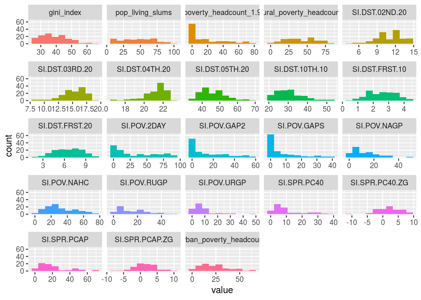
Figure 1.5: Profiling numerical data
We can adjust the number of bars used in the plot by changing the bins parameter (default value is set to 10). For example: plot_num(data_world_wide, bins = 20).
1.1.4 Final thoughts
Many numbers have appeared here so far, and even more in the percentile appendix. The important point is for you to find the right approach to explore your data. This can come from other metrics or other criteria.
The functions df_status, describe, freq, profiling_num and plot_num can be run at the beginning of a data project.
Regarding the normal and abnormal behavior on data, it’s important to study both. To describe the dataset in general terms, we should exclude the extreme values: for example, with range_98 variable. The mean should decrease after the exclusion.
These analyses are univariate; that is, they do not take into account other variables (multivariate analysis). This will be part of this book later on. Meanwhile, for the correlation between input (and output) variables, you can check the Correlation chapter.
![]()
1.2 Correlation and Relationship

Manderbolt fractal, where the chaos expresses its beauty; image source: Wikipedia.
1.2.1 What is this about?
This chapter contains both methodological and practical aspects of measuring correlation in variables. We will see that correlation word can be translated into “functional relationship”.
In methodological you will find the Anscombe Quartet, a set of four plots with dissimilar spatial distribution, but sharing the same correlation measure. We’ll go one step ahead re-calculating their relationship though a more robust metric (MIC).
We will mention Information Theory several times, although by now it’s not going to be covered at the mathematical level, it’s planned to. Many algorithms are based on it, even deep learning.
Understanding these concepts in low dimension (two variables) and small data (a bunch of rows) allow us to better understand high dimensional data. Nonetheless, some real cases are only small data.
From the practical point of view, you’ll be able to replicate the analysis with your own data, profiling and exposing their relationships in fancy plots.
Let’s starting loading all needed libraries.
# Loading needed libraries
library(funModeling) # contains heart_disease data
library(minerva) # contains MIC statistic
library(ggplot2)
library(dplyr)
library(reshape2)
library(gridExtra) # allow us to plot two plots in a row
options(scipen=999) # disable scientific notation
1.2.2 Linear correlation
Perhaps the most standard correlation measure for numeric variables is the R statistic (or Pearson coefficient) which goes from 1 positive correlation to -1 negative correlation. A value around 0 implies no correlation.
Consider the following example, which calculates R measure based on a target variable (for example to do feature engineering). Function correlation_table retrieves R metric for all numeric variables skipping the categorical/nominal ones.
correlation_table(data=heart_disease, target="has_heart_disease")## Variable has_heart_disease
## 1 has_heart_disease 1.00
## 2 heart_disease_severity 0.83
## 3 num_vessels_flour 0.46
## 4 oldpeak 0.42
## 5 slope 0.34
## 6 age 0.23
## 7 resting_blood_pressure 0.15
## 8 serum_cholestoral 0.08
## 9 max_heart_rate -0.42Variable heart_disease_severity is the most important -numerical- variable, the higher its value the higher the chances of having a heart disease (positive correlation). Just the opposite to max_heart_rate, which has a negative correlation.
Squaring this number returns the R-squared statistic (aka R2), which goes from 0 no correlation to 1 high correlation.
R statistic is highly influenced by outliers and non-linear relationships.
1.2.2.1 Correlation on Anscombe’s Quartet
Take a look at the Anscombe’s quartet, quoting Wikipedia:
They were constructed in 1973 by the statistician Francis Anscombe to demonstrate both the importance of graphing data before analyzing it and the effect of outliers on statistical properties.
1973 and still valid, fantastic.
These four relationships are different, but all of them have the same R2: 0.816.
Following example calculates the R2 and plot every pair.
# Reading anscombe quartet data
anscombe_data =
  read.delim(file="https://goo.gl/mVLz5L", header = T)

# calculating the correlation (R squared, or R2) for
#every pair, every value is the same: 0.86.
cor_1 = cor(anscombe_data$x1, anscombe_data$y1)
cor_2 = cor(anscombe_data$x2, anscombe_data$y2)
cor_3 = cor(anscombe_data$x3, anscombe_data$y3)
cor_4 = cor(anscombe_data$x4, anscombe_data$y4)

# defining the function
plot_anscombe <- function(x, y, value, type)
{
  # 'anscombe_data' is a global variable, this is
  # a bad programming practice ;)
  p=ggplot(anscombe_data, aes_string(x,y))  +
    geom_smooth(method='lm', fill=NA) +
    geom_point(aes(colour=factor(1),
                   fill = factor(1)),
               shape=21, size = 2
               ) +
    ylim(2, 13) +
    xlim(4, 19) +
    theme_minimal() +
    theme(legend.position="none") +
    annotate("text",
             x = 12,
             y =4.5,
             label =
               sprintf("%s: %s",
                       type,
                       round(value,2)
                       )
             )

  return(p)
}

# plotting in a 2x2 grid
grid.arrange(plot_anscombe("x1", "y1", cor_1, "R2"),
             plot_anscombe("x2", "y2", cor_2, "R2"),
             plot_anscombe("x3", "y3", cor_3, "R2"),
             plot_anscombe("x4", "y4", cor_4, "R2"),
             ncol=2,
             nrow=2)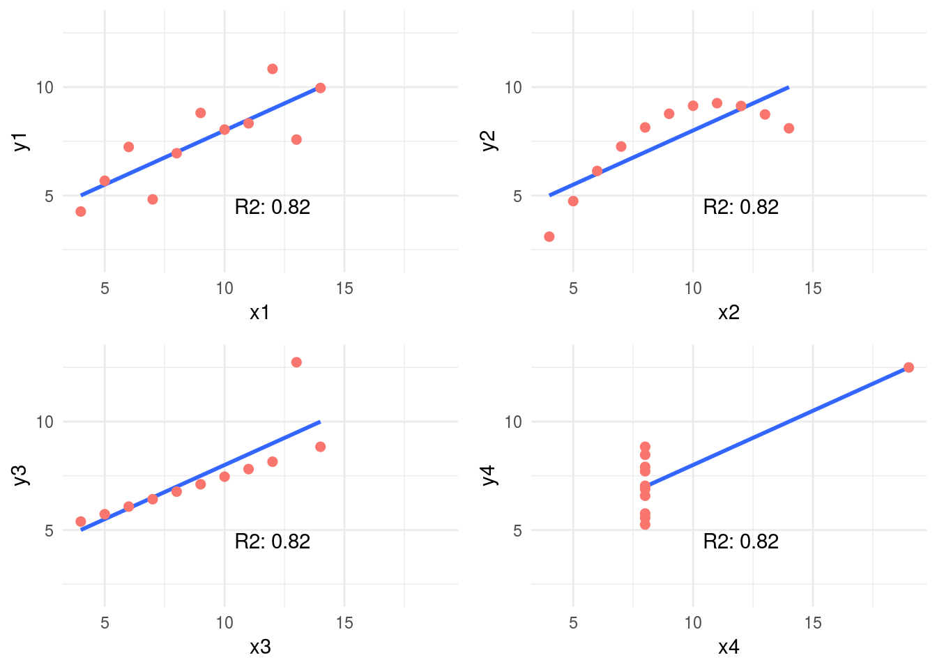
Figure 1.6: Anscombe set
4-different plots, having the same mean for every x and y variable (9 and 7.501 respectively), and the same degree of correlation. You can check all the measures by typing summary(anscombe_data).
This is why is so important to plot relationships when analyzing correlations.
We’ll back on this data later. It can be improved! First, we’ll introduce some concepts of information theory.
1.2.3 Correlation based on Information Theory
This relationships can be measure better with Information Theory concepts. One of the many algorithms to measure correlation based on this is: MINE, acronym for: Maximal Information-based nonparametric exploration.
The implementation in R can be found in minerva package. It’s also available in other languages like Python.
1.2.3.1 An example in R: A perfect relationship
Let’s plot a non-linear relationship, directly based on a function (negative exponential), and print the MIC value.
x=seq(0, 20, length.out=500)
df_exp=data.frame(x=x, y=dexp(x, rate=0.65))
ggplot(df_exp, aes(x=x, y=y)) + geom_line(color='steelblue') + theme_minimal()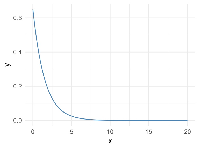
Figure 1.7: A perfect relationship
# position [1,2] contains the correlation of both variables, excluding the correlation measure of each variable against itself.

# Calculating linear correlation
res_cor_R2=cor(df_exp)[1,2]^2
sprintf("R2: %s", round(res_cor_R2,2))
## [1] "R2: 0.39"# now computing the MIC metric
res_mine=mine(df_exp)
sprintf("MIC: %s", res_mine$MIC[1,2])## [1] "MIC: 1"MIC value goes from 0 to 1. Being 0 implies no correlation and 1 highest correlation. The interpretation is the same as the R-squared.
1.2.3.2 Results analysis
The MIC=1 indicates there is a perfect correlation between the two variables. If we were doing feature engineering this variable should be included.
Further than a simple correlation, what the MIC says is: “Hey these two variables show a functional relationship”.
In machine learning terms (and oversimplifying): “variable y is dependant of variable x and a function -that we don’t know which one- can be found model the relationship.”
This is tricky because that relationship was effectively created based on a function, an exponential one.
But let’s continue with other examples…
1.2.4 Adding noise
Noise is an undesired signal adding to the original one. In machine learning noise helps the model to get confused. Concretely: two identical input cases -for example customers- have different outcomes -one buy and the other doesn’t-.
Now we are going to add some noise creating the y_noise_1 variable.
df_exp$y_noise_1=jitter(df_exp$y, factor = 1000, amount = NULL)
ggplot(df_exp, aes(x=x, y=y_noise_1)) +
  geom_line(color='steelblue') + theme_minimal()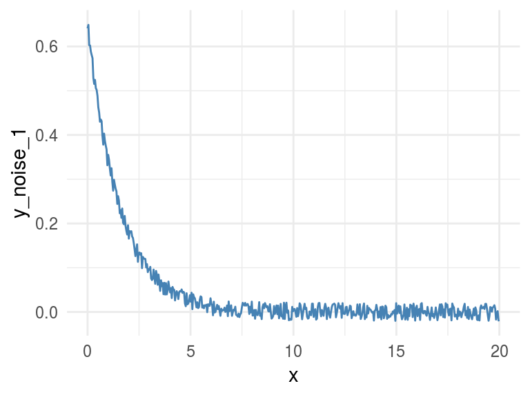
Figure 1.8: Adding some noise
Calculating the correlation and MIC again, printing in both cases the entire matrix, which shows the correlation/MIC metric of each input variable against all the others including themselves.
# calculating R squared
res_R2=cor(df_exp)^2
res_R2
## x y y_noise_1
## x 1.00 0.39 0.39
## y 0.39 1.00 0.99
## y_noise_1 0.39 0.99 1.00# Calculating mine
res_mine_2=mine(df_exp)
# Printing MIC
res_mine_2$MIC## x y y_noise_1
## x 1.00 1.00 0.74
## y 1.00 1.00 0.74
## y_noise_1 0.74 0.74 1.00Adding noise to the data decreases the MIC value from 1 to 0.7226365 (-27%), and this is great!
R2 also decreased but just a little bit, from 0.3899148 to 0.3866319 (-0.8%).
Conclusion: MIC reflects a noisy relationship much better than R2, and it’s helpful to find correlated associations.
About the last example: Generate data based on a function is only for teaching purposes. But the concept of noise in variables is quite common in almost every data set, no matter its source. You don’t have to do anything to add noise to variables, it’s already there. Machine learning models deal with this noise, by approaching to the real shape of data.
It’s quite useful to use the MIC measure to get a sense of the information present in a relationship between two variables.
1.2.5 Measuring non-linearity (MIC-R2)
mine function returns several metrics, we checked only MIC, but due to the nature of the algorithm (you can check the original paper (Reshef et al. 2011)), it computes more interesting indicators. Check them all by inspecting res_mine_2 object.
One of them is MICR2, used as a measure of non-linearity. It is calculated by doing the: MIC - R2. Since R2 measures the linearity, a high MICR2 would indicate a non-linear relationship.
We can check it by calculating the MICR2 manually, following two matrix returns the same result:
# MIC r2: non-linearity metric
round(res_mine_2$MICR2, 3)
# calculating MIC r2 manually
round(res_mine_2$MIC-res_R2, 3)
Non-linear relationships are harder to build a model, even more using a linear algorithm like decision trees or linear regression.
Imagine we need to explain the relationship to another person, we’ll need “more words” to do it. It’s easier to say: “A increases as B increases and the ratio is always 3x” (if A=1 then B=3, linear).
In comparison to: “A increases as B increases, but A is almost 0 until B reaches the value 10, then A raises to 300; and when B reaches 15, A goes to 1000.”
# creating data example
df_example=data.frame(x=df_exp$x,
                      y_exp=df_exp$y,
                      y_linear=3*df_exp$x+2)

# getting mine metrics
res_mine_3=mine(df_example)

# generating labels to print the results
results_linear =
  sprintf("MIC: %s \n MIC-R2 (non-linearity): %s",
          res_mine_3$MIC[1,3],
          round(res_mine_3$MICR2[1,3],2)
          )

results_exp =
  sprintf("MIC: %s \n MIC-R2 (non-linearity): %s",
          res_mine_3$MIC[1,2],
          round(res_mine_3$MICR2[1,2],4)
          )

# Plotting results
# Creating plot exponential variable
p_exp=ggplot(df_example, aes(x=x, y=y_exp)) +
  geom_line(color='steelblue') +
  annotate("text", x = 11, y =0.4, label = results_exp) +
  theme_minimal()

# Creating plot linear variable
p_linear=ggplot(df_example, aes(x=x, y=y_linear)) +
  geom_line(color='steelblue') +
  annotate("text", x = 8, y = 55,
           label = results_linear) +
  theme_minimal()

grid.arrange(p_exp,p_linear,ncol=2)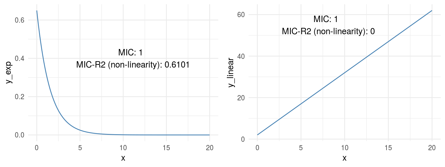
Figure 1.9: Comparing relationships
Both plots show a perfect correlation (or relationship), holding an MIC=1. Regarding non-linearity, MICR2 behaves as expected, in y_exp=0.6101, and in y_linear=0.
This point is important since the MIC behaves like R2 does in linear relationships, plus it adapts quite well to non-linear relationships as we saw before, retrieving a particular score metric (MICR2) to profile the relationship.
1.2.6 Measuring information on Anscombe Quartet
Remember the example we review at the beginning? Every pair of Anscombe Quartet returns a R2 of 0.86. But based on its plots it was clearly that not every pair exhibits neither a good correlation nor a similar distribution of x and y.
But what happen if we measure the relationship with a metric based on Information Theory? Yes, MIC again.
# calculating the MIC for every pair
mic_1=mine(anscombe_data$x1, anscombe_data$y1, alpha=0.8)$MIC
mic_2=mine(anscombe_data$x2, anscombe_data$y2, alpha=0.8)$MIC
mic_3=mine(anscombe_data$x3, anscombe_data$y3, alpha=0.8)$MIC
mic_4=mine(anscombe_data$x4, anscombe_data$y4, alpha=0.8)$MIC

# plotting MIC in a 2x2 grid
grid.arrange(plot_anscombe("x1", "y1", mic_1, "MIC"), plot_anscombe("x2", "y2", mic_2,"MIC"), plot_anscombe("x3", "y3", mic_3,"MIC"), plot_anscombe("x4", "y4", mic_4,"MIC"), ncol=2, nrow=2)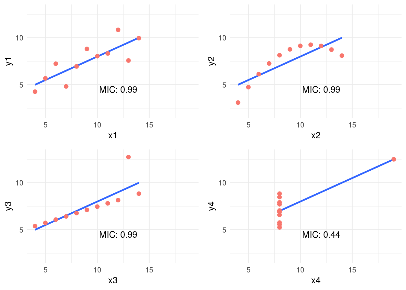
Figure 1.10: MIC statistic
As you may notice we increased the alpha value to 0.8, this is a good practice -according to the documentation- when we analyzed small samples. The default value is 0.6 and its maximum 1.
In this case, MIC value spotted the most spurious relationship in the pair x4 - y4. Probably due to a few cases per plot (11 rows) the MIC was the same for all the others pairs. Having more cases will show different MIC values.
But when combining the MIC with MIC-R2 (non-linearity measurement) new insights appears:
# Calculating the MIC for every pair, note the "MIC-R2" object has the hyphen when the input are two vectors, unlike when it takes a data frame which is "MICR2".
mic_r2_1=mine(anscombe_data$x1, anscombe_data$y1, alpha = 0.8)$`MIC-R2`
mic_r2_2=mine(anscombe_data$x2, anscombe_data$y2, alpha = 0.8)$`MIC-R2`
mic_r2_3=mine(anscombe_data$x3, anscombe_data$y3, alpha = 0.8)$`MIC-R2`
mic_r2_4=mine(anscombe_data$x4, anscombe_data$y4, alpha = 0.8)$`MIC-R2`

# Ordering according mic_r2
df_mic_r2=data.frame(pair=c(1,2,3,4), mic_r2=c(mic_r2_1,mic_r2_2,mic_r2_3,mic_r2_4)) %>% arrange(-mic_r2)
df_mic_r2
## pair mic_r2
## 1 2 0.33
## 2 3 0.33
## 3 1 0.33
## 4 4 -0.23Ordering decreasingly by its non-linearity the results are consisent with the plots: 2 > 3 > 1 > 4. Something strange for pair 4, a negative number. This is because MIC is lower than the R2. A relationship that worth to be plotted.
1.2.7 Measuring non-monotonicity: MAS measure
MINE can also help us to profile time series regarding its non-monotonicity with MAS (maximum asymmetry score).
A monotonic series is such it never changes its tendency, it always goes up or down. More on this on (Wikipedia 2017b).
Following example simulates two-time series, one not-monotonic y_1 and the other monotonic y_2.
# creating sample data (simulating time series)
time_x=sort(runif(n=1000, min=0, max=1))
y_1=4*(time_x-0.5)^2
y_2=4*(time_x-0.5)^3

# Calculating MAS for both series
mas_y1=round(mine(time_x,y_1)$MAS,2)
mas_y2=mine(time_x,y_2)$MAS

# Putting all together
df_mono=data.frame(time_x=time_x, y_1=y_1, y_2=y_2)

# Plotting
label_p_y_1 =
  sprintf("MAS=%s (goes down \n and up => not-monotonic)",
          mas_y1)

p_y_1=ggplot(df_mono, aes(x=time_x, y=y_1)) +
  geom_line(color='steelblue') +
  theme_minimal()  +
  annotate("text", x = 0.45, y =0.75,
           label = label_p_y_1)

label_p_y_2=
  sprintf("MAS=%s (goes up => monotonic)", mas_y2)

p_y_2=ggplot(df_mono, aes(x=time_x, y=y_2)) +
  geom_line(color='steelblue') +
  theme_minimal() +
  annotate("text", x = 0.43, y =0.35,
           label = label_p_y_2)

grid.arrange(p_y_1,p_y_2,ncol=2)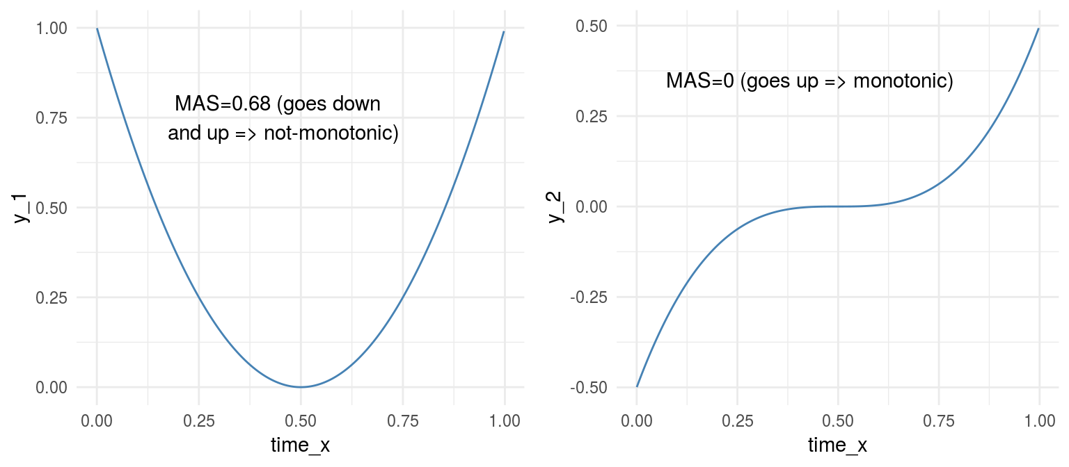
Figure 1.11: Monotonicity in functions
From another perspective, MAS is also useful to detect periodic relationships. Let’s illustrate this with an example
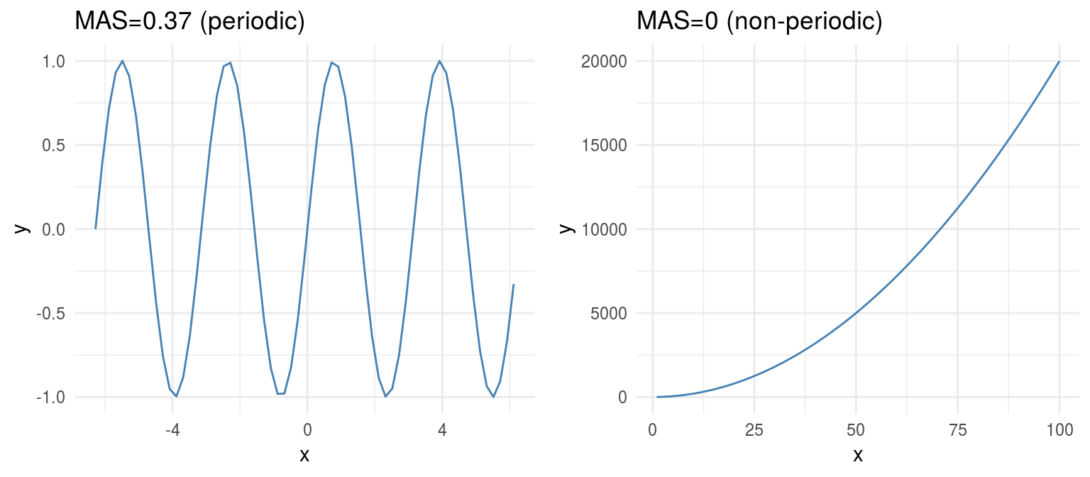
Figure 1.12: Periodicity in functions
1.2.7.1 A more real example: Time Series
Consider the following case which contains three-time series: y1, y2 and y3. They can be profiled concerning its non-monotonicity or overall growth trend.
# reading data
df_time_series =
  read.delim(file="https://goo.gl/QDUjfd")

# converting to long format so they can be plotted
df_time_series_long=melt(df_time_series, id="time")

# Plotting
plot_time_series =
  ggplot(data=df_time_series_long,
         aes(x=time, y=value, colour=variable)) +
  geom_line() +
  theme_minimal() +
  scale_color_brewer(palette="Set2")

plot_time_series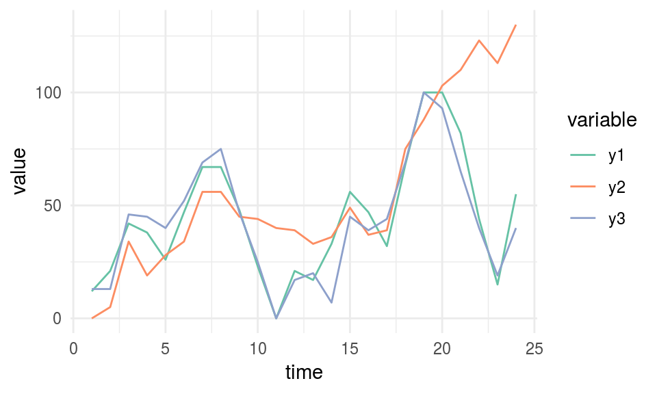
Figure 1.13: Time series example
# Calculating and printing MAS values for time series data
mine_ts=mine(df_time_series)
mine_ts$MAS
## time y1 y2 y3
## time 0.00 0.120 0.105 0.191
## y1 0.12 0.000 0.068 0.081
## y2 0.11 0.068 0.000 0.057
## y3 0.19 0.081 0.057 0.000We need to look at time column, so we’ve got the MAS value of each series regarding the time. y2 is the most monotonic (and less periodic) series, and it can be confirmed by looking at it. It seems to be always up.
MAS summary:
- MAS ~ 0 indicates monotonic or non-periodic function (“always” up or down)
- MAS ~ 1 indicates non-monotonic or periodic function
1.2.8 Correlation between time series
MIC metric can also measure the correlation in time series, it is not a general purpose tool but can be helpful to compare different series quickly.
This section is based on the same data we used in MAS example.
# printing again the 3-time series
plot_time_series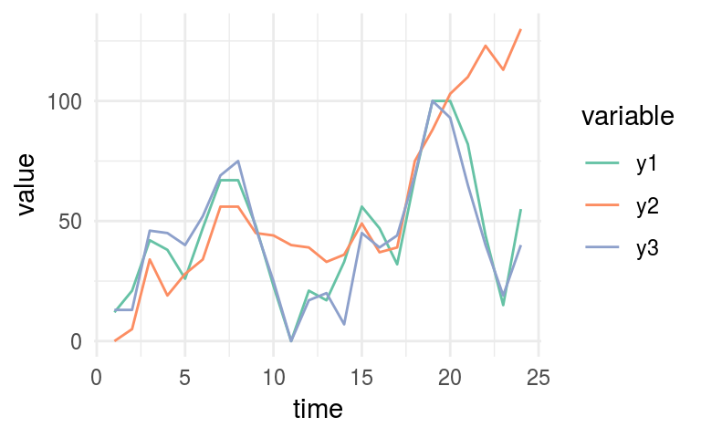
Figure 1.14: Time series example
# Printing MIC values
mine_ts$MIC
## time y1 y2 y3
## time 1.00 0.38 0.69 0.34
## y1 0.38 1.00 0.62 0.71
## y2 0.69 0.62 1.00 0.52
## y3 0.34 0.71 0.52 1.00Now we need to look at y1 column. According to MIC measure, we can confirm the same that it’s shown in last plot:
y1 is more similar to y3 (MIC=0.709) than what is y2 (MIC=0.61).
1.2.8.1 Going further: Dynamic Time Warping
MIC will not be helpful for more complex esenarios having time series which vary in speed, you would use dynamic time warping technique (DTW).
Let’s use an image to catch up the concept visually:
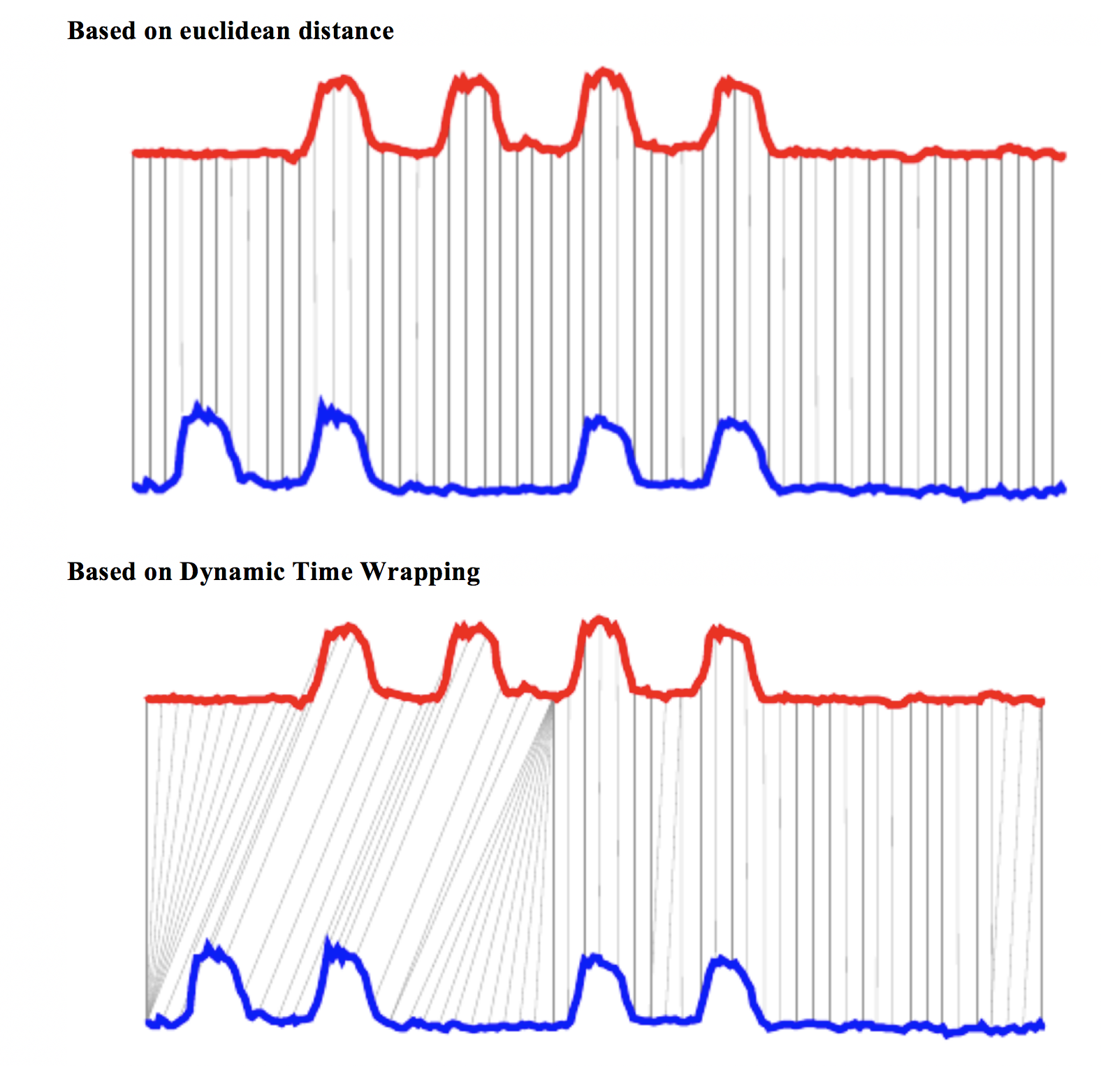
Figure 1.15: Dynamic time warping
Image source: Dynamic time wrapping Converting images into time series for data mining (Izbicki 2011).
The last image shows two different approaches to compare time series, and the euclidean is more similar to MIC measure. While DTW can track similarities occurring at different times.
A nice implementation in R: dtw package.
Finding correlations between time series is another way of performing time series clustering.
1.2.9 Correlation on categorical variables
MINE -and many other algorithms- only work with numerical data. We need to do a data preparation trick, converting every categorical variable into flag (or dummy variable).
If the original categorical variable has 30 possible values, it will result in 30 new columns holding the value 0 or 1, when 1 represents the presence of that category in the row.
If we use package caret from R, this conversion only takes two lines of code:
library(caret)

# selecting just a few variables
heart_disease_2 =
  select(heart_disease, max_heart_rate, oldpeak,
         thal, chest_pain,exer_angina, has_heart_disease)

# this conversion from categorical to a numeric is merely
# to have a cleaner plot
heart_disease_2$has_heart_disease=
  ifelse(heart_disease_2$has_heart_disease=="yes", 1, 0)

# it converts all categorical variables (factor and
# character for R) into numerical variables.
# skipping the original so the data is ready to use
dmy = dummyVars(" ~ .", data = heart_disease_2)

heart_disease_3 =
  data.frame(predict(dmy, newdata = heart_disease_2))

# Important: If you recieve this message
# `Error: Missing values present in input variable 'x'.
# Consider using use = 'pairwise.complete.obs'.`
# is because data has missing values.
# Please don't omit NA without an impact analysis first,
# in this case it is not important.
heart_disease_4=na.omit(heart_disease_3)

# compute the mic!
mine_res_hd=mine(heart_disease_4)
Printing a sample…
mine_res_hd$MIC[1:5,1:5]## max_heart_rate oldpeak thal.3 thal.6 thal.7
## max_heart_rate 1.00 0.24 0.244 0.120 0.184
## oldpeak 0.24 1.00 0.175 0.111 0.157
## thal.3 0.24 0.18 0.992 0.073 0.710
## thal.6 0.12 0.11 0.073 0.327 0.044
## thal.7 0.18 0.16 0.710 0.044 0.964Where column thal.3 takes a value of 1 when thal=3.
1.2.9.1 Printing some fancy plots!
We’ll use corrplot package in R which can plot a cor object (classical correlation matrix), or any other matrix. We will plot MIC matrix in this case, but any other can be used as well, for example, MAS or another metric that returns an squared matrix of correlations.
The two plots are based on the same data but display the correlation in different ways.
# library wto plot that matrix
library(corrplot)
## corrplot 0.84 loaded# to use the color pallete brewer.pal
library(RColorBrewer)
# hack to visualize the maximum value of the
# scale excluding the diagonal (variable against itself)
diag(mine_res_hd$MIC)=0
# Correlation plot with circles.
corrplot(mine_res_hd$MIC,
method="circle",
col=brewer.pal(n=10, name="PuOr"),
# only display upper diagonal
type="lower",
#label color, size and rotation
tl.col="red",
tl.cex = 0.9,
tl.srt=90,
# dont print diagonal (var against itself)
diag=FALSE,
# accept a any matrix, mic in this case
#(not a correlation element)
is.corr = F
)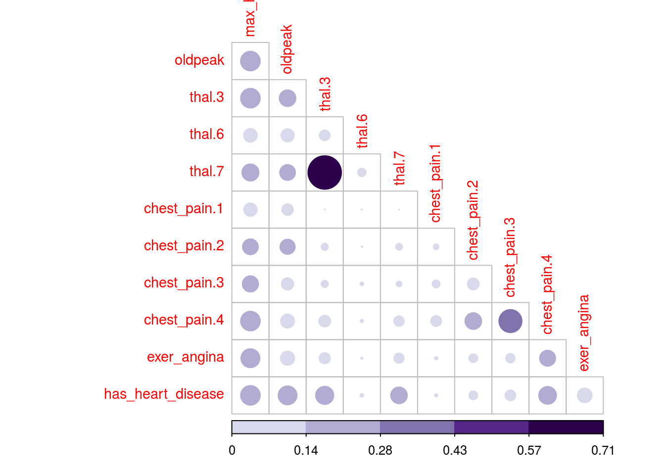
Figure 1.16: Correlation plot
# Correlation plot with color and correlation MIC
corrplot(mine_res_hd$MIC,
         method="color",
         type="lower",
         number.cex=0.7,
         # Add coefficient of correlation
         addCoef.col = "black",
         tl.col="red",
         tl.srt=90,
         tl.cex = 0.9,
         diag=FALSE,
         is.corr = F
)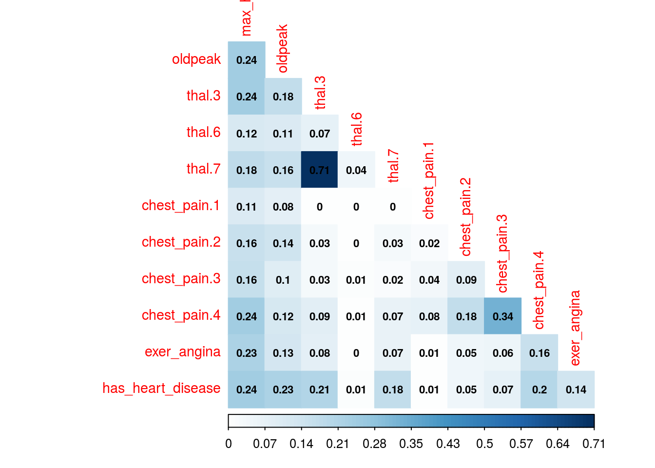
Figure 1.16: Correlation plot
Just change the first parameter -mine_res_hd$MIC- to the matrix you want and reuse with your data.
1.2.9.2 A comment about this kind of plots
They are useful only when the number of variables are not big. Or if you perform a variable selection first, keeping in mind that every variable should be numerical.
If there is some categorical variable in the selection you can convert it into numerical first and inspect the relationship between the variables, thus sneak peak how certain values in categorical variables are more related to certain outcomes, like in this case.
1.2.9.3 How about some insights from the plots?
Since the variable to predict is has_heart_disease, it appears something interesting, to have a heart disease is more correlated to thal=3 than to value thal=6.
Same analysis for variable chest_pain, a value of 4 is more dangerous than a value of 1.
And we can check it with other plot:
cross_plot(heart_disease, input = "chest_pain", target = "has_heart_disease", plot_type = "percentual")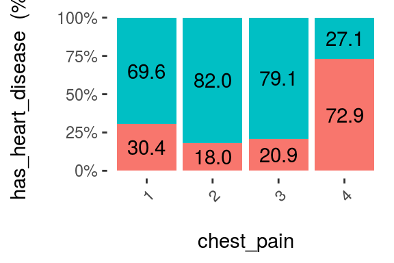
Figure 1.17: Visual analysis using cross-plot
The likelihood of having a heart disease is 72.9% if the patient has chest_pain=4. More than 2x more likely if she/(he) has chest_pain=1 (72.9 vs 30.4%).
Some thoughts…
The data is the same, but the approach to browse it is different. The same goes when we are creating a predictive model, the input data in the N-dimensional space can be approached through different models like support vector machine, a random forest, etc.
Like a photographer shooting from different angles, or different cameras. The object is always the same, but the perspective gives different information.
Combining raw tables plus different plots gives us a more real and complementary object perspective.
1.2.10 Correlation analysis based on information theory
Based on MIC measure, mine function can receive the index of the column to predict (or to get all the correlations against only one variable).
# Getting the index of the variable to
# predict: has_heart_disease
target="has_heart_disease"
index_target=grep(target, colnames(heart_disease_4))

# master takes the index column number to calculate all
# the correlations
mic_predictive=mine(heart_disease_4,
                    master = index_target)$MIC

# creating the data frame containing the results,
# ordering descently by its correlation and excluding
# the correlation of target vs itself
df_predictive =
  data.frame(variable=rownames(mic_predictive),
                         mic=mic_predictive[,1],
                         stringsAsFactors = F) %>%
  arrange(-mic) %>%
  filter(variable!=target)

# creating a colorful plot showing importance variable
# based on MIC measure
ggplot(df_predictive,
       aes(x=reorder(variable, mic),y=mic, fill=variable)
       ) +
  geom_bar(stat='identity') +
  coord_flip() +
  theme_bw() +
  xlab("") +
  ylab("Variable Importance (based on MIC)") +
  guides(fill=FALSE)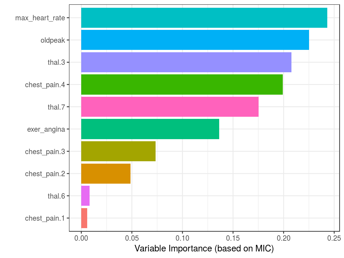
Figure 1.18: Correlation using information theory
Although it is recommended to run correlations among all variables in order to exclude correlated input features.
1.2.10.1 Practice advice for using mine
If it lasts too much time to finish, consider taking a sample. If the amount of data is too little, consider setting a higher number in alpha parameter, 0.6 is its default. Also, it can be run in parallel, just setting n.cores=3 in case you have 4 cores. A general good practice when running parallel processes, the extra core will be used by the operating system.
1.2.11 But just MINE covers this?
No. We used only MINE suite, but there are other algortihms related to mutual information. In R some of the packages are: entropy and infotheo.
Package funModeling (from version 1.6.6) introduces the function var_rank_info which calculates several information theory metrics, as it was seen in section Rank best features using information theory.
In Python mutual information can be calculated through scikit-learn, here an example.
The concept transcends the tool.
1.2.11.1 Another correlation example (mutual information)
This time we’ll use infotheo package, we need first to do a data preparation step, applying a discretize function (or binning) function present in the package. It converts every numerical variable into categorical based on equal frequency criteria.
Next code will create the correlation matrix as we seen before, but based on the mutual information index.
library(infotheo)
# discretizing every variable
heart_disease_4_disc=discretize(heart_disease_4)

# calculating "correlation" based on mutual information
heart_info=mutinformation(heart_disease_4_disc, method= "emp")

# hack to visualize the maximum value of the scale excluding the diagonal (var against itself)
diag(heart_info)=0

# Correlation plot with color and correlation Mutual Information from Infotheo package. This line only retrieves the plot of the right.
corrplot(heart_info, method="color",type="lower", number.cex=0.6,addCoef.col = "black", tl.col="red", tl.srt=90, tl.cex = 0.9, diag=FALSE, is.corr = F)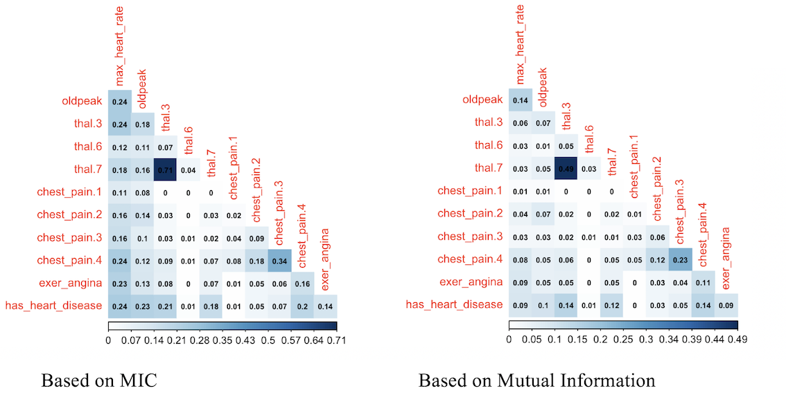
Figure 1.19: Comparing variable importance
Correlation score based on mutual information ranks relationships pretty similar to MIC, doesn’t it?
1.2.12 Information Measures: A general perspective
Further than correlation, MIC or other information metric measure if there is a functional relationship.
A high MIC value indicates that the relationship between the two variables can be explained by a function. Is our job to find that function or predictive model.
This analysis is extended to n-variables, this book introduces another algorithm in the selecting best variables chapter.
Some predictive models perform better than other, but if the relationship is absolutely noisy no matter how advance the algorithm is, it will end up in bad results.
More to come on Information Theory. By now you check these didactical lectures:
- 7-min introductory video https://www.youtube.com/watch?v=2s3aJfRr9gE
- http://alex.smola.org/teaching/cmu2013-10-701x/slides/R8-information_theory.pdf
- http://www.scholarpedia.org/article/Mutual_information
1.2.13 Conclusions
Anscombe’s quartet taught us the good practice of getting the raw statistic together with a plot.
We could see how noise can affect the relationship between two variables, and this phenomenon always appears in data. Noise in data confuses the predictive model.
Noise is related to error, and it can be studied with measures based on information theory such as mutual information and maximal information coefficient, which go one further step than typical R squared. There is a clinical study which uses MINE as feature selector in (Caban et al. 2012).
These methods are applicable in feature engineering as a method which does not rely on a predictive model to rank most important variables. Also applicable to cluster time series.
Next recommended chapter: Selecting best variables
![]()
References
McNeese, Bill. 2016. “Are the Skewness and Kurtosis Useful Statistics?” https://www.spcforexcel.com/knowledge/basic-statistics/are-skewness-and-kurtosis-useful-statistics.
Handbook, Engineering Statistics. 2013. “Measures of Skewness and Kurtosis.” http://www.itl.nist.gov/div898/handbook/eda/section3/eda35b.htm.
Reshef, David N., Yakir A. Reshef, Hilary K. Finucane, Sharon R. Grossman, Gilean McVean, Peter J. Turnbaugh, Eric S. Lander, Michael Mitzenmacher, and Pardis C. Sabeti. 2011. “Detecting Novel Associations in Large Data Sets.” Science 334 (6062): 1518–24. doi:10.1126/science.1205438.
Wikipedia. 2017b. “Monotonic Function.” https://en.wikipedia.org/wiki/Monotonic_function.
Izbicki, Mike. 2011. “Converting Images into Time Series for Data Mining.” https://izbicki.me/blog/converting-images-into-time-series-for-data-mining.html.
Caban, Jesus J., Ulas Bagci, Alem Mehari, Shoaib Alam, Joseph R. Fontana, Gregory J. Kato, and Daniel J. Mollura. 2012. “Characterizing Non-Linear Dependencies Among Pairs of Clinical Variables and Imaging Data.” Conf Proc IEEE Eng Med Biol Soc 2012 (August): 2700–2703. doi:10.1109/EMBC.2012.6346521.